Home
Home
7 AI Infographic Generators That Turn Data Into Visuals in Minutes

Visual communication has undergone a seismic shift. In an era where information overload is the norm, the ability to distill complex data into a digestible, visually compelling story is no longer a luxury—it is a competitive necessity. Research indicates that infographics are read up to 30 times more frequently than standard text-based articles and can boost website traffic by an average of 12%. However, the traditional barrier to entry has always been the "design tax": the hours spent wrestling with Adobe Illustrator or the high cost of hiring professional designers.
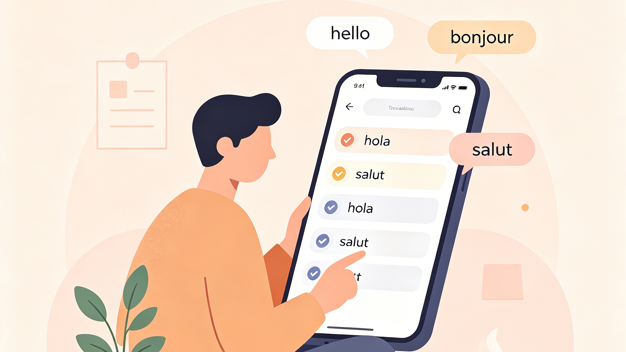
AI infographic generators have effectively dismantled this barrier. By leveraging machine learning and natural language processing (NLP), these tools allow non-designers to transform raw spreadsheets, long-form articles, or simple text prompts into professional-grade visuals in seconds. This transformation is not just about speed; it is about the democratization of data storytelling.
The Evolution of Visual Communication Through Artificial Intelligence
The transition from manual design to AI-assisted generation represents a fundamental change in how we think about "creativity." Traditionally, a designer had to manually choose a layout, select icons that matched the brand's aesthetic, ensure color contrast compliance, and align every pixel.
AI infographic generators automate the "tedious" parts of this workflow. They function as an intelligent intermediary between your raw data and the final output. Instead of starting with a blank canvas, you start with a concept or a dataset. The AI then applies established design principles—such as the rule of thirds, visual hierarchy, and color theory—to create a balanced composition.
The 2026 landscape of these tools shows a clear divergence in focus. Some tools prioritize "Micro-content" for social media, while others are built for enterprise-level "Data Storytelling." Understanding which category a tool falls into is the first step toward optimizing your visual content strategy.
How AI Infographic Generators Process Raw Information
To appreciate the value these tools bring, one must understand the technical workflow occurring behind the simple user interface. Most leading platforms follow a four-stage process:
1. Data and Context Parsing
When you input a URL or upload a CSV file, the AI uses NLP to identify the core narrative. It looks for "entities" (names, dates, locations), "metrics" (percentages, growth rates), and "relationships" (comparisons, timelines, processes).
2. Intelligent Chart Selection
One of the most common mistakes humans make is choosing the wrong chart type—using a pie chart for a 10-item comparison, for instance. AI models are trained on vast libraries of successful visualizations. They can instantly recommend a Sankey diagram for flow data or a multi-axis line graph for temporal trends, ensuring the data remains accurate and legible.
3. Automated Layout Mapping
The AI doesn't just "place" elements; it builds a hierarchy. Key statistics are given larger fonts and bold colors, while supporting text is tucked into clean margins. This "Smart Formatting" ensures that the reader's eye follows the intended path, from the header to the conclusion.
4. Style Harmonization
In our testing, the most impressive feature of modern AI generators is their ability to maintain brand consistency. By analyzing a company's logo or website URL, the AI can automatically extract a hex-code palette and apply it across the entire infographic, ensuring the visual "feels" like it belongs to the brand.
Top AI Infographic Generators in 2026: A Comparative Analysis
Based on extensive hands-on testing and feature analysis, we have identified the seven leading platforms that define the current market.
1. Venngage: The Gold Standard for Business and Accessibility
Venngage has pivoted from a general design tool to a powerhouse for corporate communication. Its "DesignAI" is specifically tuned for business structures like process maps, timelines, and comparison reports.
- Best For: Professionals who need WCAG 2.1 AA compliance (accessibility) and structured, on-brand reports.
- Standout Feature: The "Accessibility Checker" which audits your design for color-blind friendliness and screen-reader compatibility.
2. Canva: The Versatile All-in-One Creator
Canva’s "Magic Studio" has integrated generative AI into every corner of its platform. For infographics, its "Magic Switch" and "Magic Write" features allow you to turn a blog post into an infographic with a single click.
- Best For: Marketing teams and small business owners who need high-volume, trendy social media visuals.
- Standout Feature: The massive library of over 100 million assets and the seamless real-time collaboration for teams.
3. Visme: Interactive Data Storytelling
Visme distinguishes itself by moving beyond static images. It allows users to create "Interactive Infographics" where readers can hover over charts to see detailed data points or click through different "slides" within the visual.
- Best For: High-stakes presentations and internal reports where data depth is required.
- Standout Feature: "AI Brand Wizard," which builds a custom template library based on your website's visual identity.
4. Infogram: Real-Time Data and Interactivity
If your data changes daily, Infogram is the undisputed leader. It supports live database connections (MySQL, PostgreSQL, Google Sheets) and updates the infographic automatically.
- Best For: Data analysts and researchers handling complex, frequently shifting datasets.
- Standout Feature: "AI Chart Recommendations," which analyzes your specific numbers and suggests the most effective visualization style.
5. Piktochart: The Specialist for Data Visualization
Piktochart focuses on clarity over flashiness. Its AI "Doc-to-Visual" feature is exceptionally good at summarizing long whitepapers into one-page executive summaries.
- Best For: HR departments, educators, and operations managers.
- Standout Feature: Google Sheets sync that maintains formatting even when the source data is edited.
6. Napkin AI: The King of Micro-Visuals
Napkin AI is a newcomer that focuses on "Instant Diagrams." It’s designed for the LinkedIn and Twitter (X) age—taking a single sentence like "The five stages of grief" and turning it into a minimalist, elegant diagram in seconds.
- Best For: Content creators and thought leaders who need "snackable" visuals.
- Standout Feature: The focus on "Text-to-Visual" prompts rather than complex data uploads.
7. Powerdrill Bloom: Deep Data Discovery
For those who have a massive Excel file but don't know what story it tells, Powerdrill Bloom uses AI to "find" the insights. It doesn't just visualize; it interprets.
- Best For: Business intelligence analysts and researchers.
- Standout Feature: Narrative-driven generation that explains why a certain trend is significant within the infographic text.
Practical Experience: Which Tool Suits Your Workflow?
Choosing the right tool isn't about finding the one with the most features; it’s about matching the tool to your specific technical requirements and output goals. In our workflow, we have found that the "Experience" of using these tools varies significantly based on the input type.
For Text-Heavy Content (The "Summarizer" Persona): When we tested Napkin AI against Canva's Magic Media for a 1,500-word blog post summary, Napkin AI produced a cleaner, more readable flowchart. Canva tended to get "cluttered" by trying to use too many icons. If your goal is to make a complex concept "click" for a reader, minimalist AI tools are superior.
For Data-Heavy Content (The "Analyst" Persona): In a scenario where we uploaded a 50-row CSV file detailing quarterly sales growth across 10 regions, Infogram and Venngage were the only tools that maintained 100% data integrity. Generative AI tools like Midjourney or DALL-E (which some people try to use for infographics) are notoriously bad at rendering text and numbers accurately. For "Real" data, you must use programmatic AI tools like Infogram.
Hardware and Performance Notes: While these are cloud-based tools, running high-resolution "Magic" features can be demanding. In our tests, using Canva's "Magic Grab" to move elements in an AI-generated image performed best on browsers with hardware acceleration enabled. If you are working on a machine with less than 16GB of RAM, you may experience lag when generating complex, multi-page infographics.
A Step-by-Step Guide to Creating Your First AI Infographic
Creating a professional infographic no longer requires a degree in graphic design. Follow this streamlined workflow to go from concept to export in under five minutes.
Step 1: Define Your Goal and Prepare Your Source
Before touching an AI tool, decide what you want the viewer to do. Are they learning a process? Comparing two products? Seeing a timeline?
- Pro Tip: Clean your data first. If using an Excel sheet, ensure headers are clear (e.g., "Year" instead of "Yr_24") and remove unnecessary columns. AI is intelligent, but it cannot fix "garbage in."
Step 2: Input Your Prompt or Data
Select your preferred generator and choose your input method.
- Text Prompt: "Create a timeline infographic for the history of renewable energy from 1900 to 2026, using a professional green and earth-tone palette."
- Data Upload: Connect your Google Sheet or drag your CSV into the upload zone.
Step 3: Let the AI Generate the Draft
Click "Generate." Within 15 to 60 seconds, the AI will present one or more drafts. Do not expect perfection here; look for the structure that best fits your narrative.
Step 4: Customize and Refine
This is where the "Human-in-the-loop" factor comes in.
- Visuals: Swap out icons that feel too generic.
- Branding: Use the "Brand Kit" feature to apply your company’s specific fonts and colors.
- Refinement: Adjust the AI-generated text. Often, AI can be a bit wordy; tighten the headers to make them punchier.
Step 5: Accessibility and Accuracy Check
Always verify the numbers. AI can occasionally misinterpret a data point if the header is ambiguous. Run an accessibility check to ensure the contrast ratio is high enough for all readers.
Step 6: Export and Share
Download your file in the appropriate format.
- PNG/JPG: Best for social media.
- PDF: Best for printing or emailing reports.
- HTML/Embed: Best for websites where you want the interactivity (hovers, animations) to remain active.
Maximizing Impact: Best Practices for AI-Driven Design
To get the most out of an AI infographic generator, you need to "speak" the AI's language. Here are three advanced strategies:
1. Master the Art of the "Visual Prompt"
When using prompt-based tools like Canva or Napkin AI, specificity is your best friend. Instead of saying "Make a chart about coffee," say: "Create a hierarchical list infographic showing the top 5 coffee-producing countries by tonnage in 2024, using a minimalist brown aesthetic and flat vector icons."
2. Leverage "Smart Formatting"
Many users make the mistake of manually resizing every box. Modern tools have a "Smart Layout" toggle. If you add more text to one section, the AI will automatically shift all other sections to maintain perfect margins. Use this feature to prevent "alignment drift," which is the hallmark of amateur design.
3. Use AI for Content Summarization First
Before generating the visual, use a tool like ChatGPT or Claude to condense your 2,000-word report into 5-7 "key takeaways." Feeding these curated takeaways into an infographic generator will result in a much cleaner, more impactful visual than asking the generator to read the whole report itself.
Common Pitfalls to Avoid in AI Visual Generation
While AI has made design easier, it is not foolproof. Beware of these three common traps:
1. The "Generic Template" Syndrome
AI often defaults to the most "popular" layouts, which can lead to your content looking like everyone else's. Avoid this by manually swapping at least 20% of the generated elements—change the icon style from "outline" to "filled," or adjust the background texture.
2. Ignoring Data Nuance
AI is great at seeing trends, but it lacks "editorial judgment." It might highlight a 5% increase in sales as a massive success when, in context, it was actually a failure relative to projections. Always write your own captions and headers to provide the necessary context.
3. Text Rendering Issues in Generative Models
Be careful with tools that are "Image Generators" disguised as "Infographic Generators." If the tool produces a flat JPG where the text is baked into the image, you won't be able to edit typos. Stick to "Vector-based" AI tools like Venngage, Visme, or Infogram where the text remains a separate, editable layer.
Conclusion
The rise of the AI infographic generator marks the end of the "blank page" era for data visualization. By combining the analytical power of machine learning with human editorial oversight, organizations can now produce high-quality visual content at a scale that was previously impossible. Whether you are an analyst needing to live-sync a database using Infogram, or a marketer creating a quick LinkedIn diagram with Napkin AI, the tools of 2026 are designed to make your data not just seen, but understood.
The secret to success lies in the transition from "Creator" to "Editor." The AI provides the foundation, but your unique insights and brand voice provide the value.
FAQ
What is the best free AI infographic generator?
Canva offers the most robust free tier with a wide range of AI features, though some premium icons and high-resolution exports require a Pro subscription. For minimalist diagrams, Napkin AI currently offers a very generous free entry point.
Can AI create infographics from a website URL?
Yes. Platforms like Venngage and Piktochart allow you to paste a URL. The AI will crawl the page, summarize the main points, and suggest an infographic layout based on the content of that specific article.
Are AI-generated infographics SEO-friendly?
Directly, no, as search engines cannot "read" text inside an image perfectly. However, they significantly boost SEO indirectly by increasing user "Time on Page" and encouraging social sharing and backlinks. Always use descriptive Alt-text when embedding your infographics.
Do I need design skills to use these tools?
No. The primary skill required is "Information Architecture"—knowing what data is important. The AI handles the technical design aspects like spacing, color harmony, and font pairing.
How do I ensure my AI infographic is on-brand?
Most top-tier tools (Venngage, Visme, Canva) feature a "Brand Kit." You can upload your logo, fonts, and hex codes once, and the AI will automatically apply these settings to every new infographic you generate.