Home
Home
7 Strategic 3 Image Layouts for High-Impact Visual Content
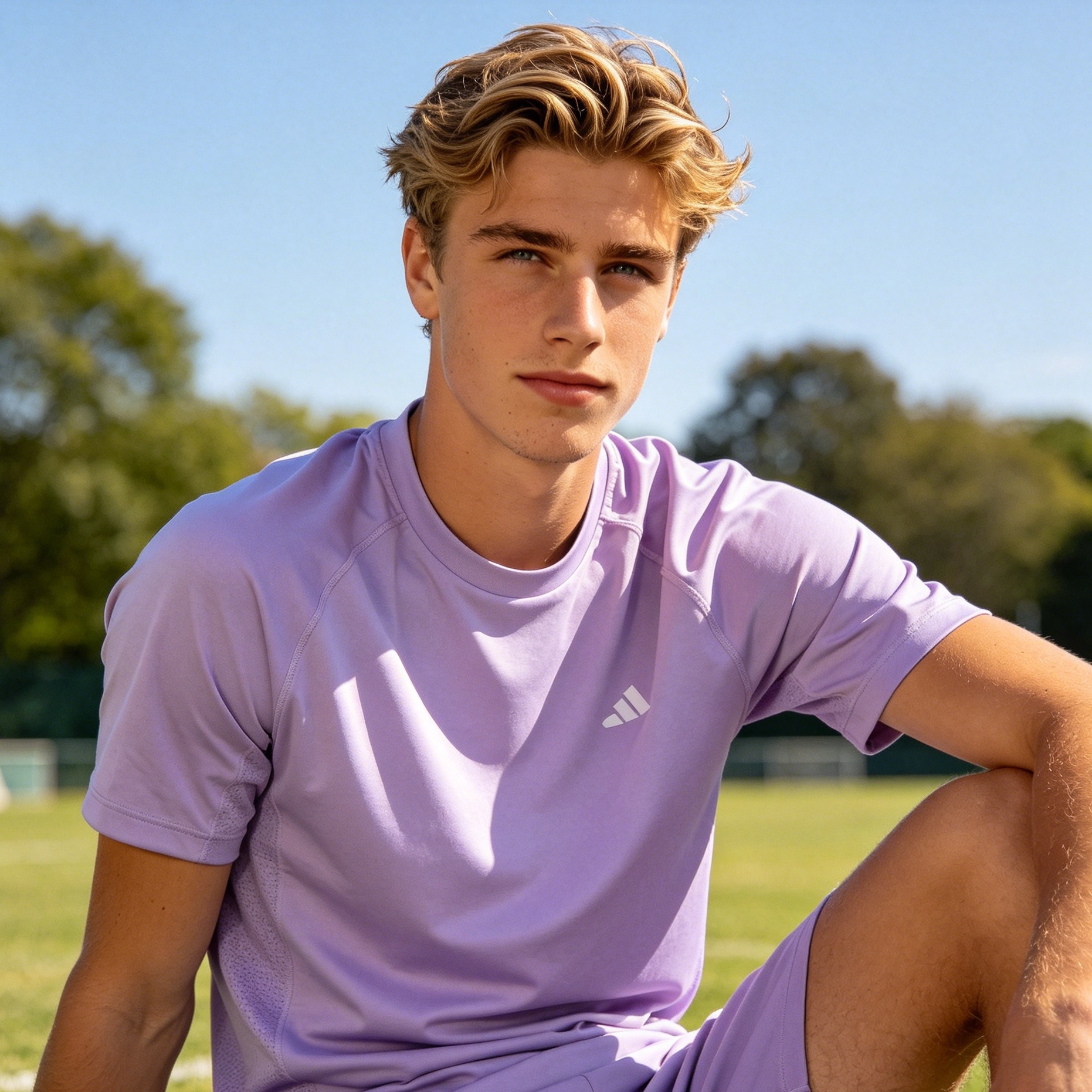
Visual communication hinges on how elements are arranged to guide the viewer’s eye. When dealing with three distinct visual assets, the challenge is to create harmony without sacrificing individual clarity. The "Rule of Threes" suggests that things arranged in odd numbers are inherently more persuasive, memorable, and visually appealing than even-numbered groupings. In graphic and web design, a 3 image layout serves as the perfect balance between simplicity and complexity, offering enough variety to tell a story while remaining digestible at a glance.
This analysis explores the most effective ways to structure three images, examining the psychological principles that make these layouts work and providing technical specifications for implementation across different media.
1. The Symmetrical Triptych: The Power of Equal Weight
The symmetrical triptych is the most traditional 3 image layout. It features three images of identical size and aspect ratio, placed side-by-side or stacked vertically. This layout is rooted in classical art, where three panels were often used to depict a religious or historical narrative.
The Psychology of Balance
Symmetry signals order, stability, and professionalism. When images are given equal screen real estate, the viewer perceives them as having equal importance. This is ideal for showcasing a series of related products, different angles of the same object, or a chronological sequence where no single moment outweighs the others.
Technical Implementation
For web design, this layout typically utilizes a 1:1:1 column ratio. To maintain a modern feel:
- Gutter Width: Use a narrow gutter (2px to 8px) for a seamless, cinematic look, or a wide gutter (24px+) to create a gallery-like atmosphere.
- Aspect Ratios: 1:1 (square) is the safest choice for social media grids, while 4:5 or 2:3 (portrait) provides a more elegant, tall aesthetic for editorial content.
- Visual Continuity: In our testing, the triptych fails if the color grading differs significantly between images. Apply a consistent LUT or filter to ensure the three panels feel like a single unit.
2. The Hero & Sidekicks: Establishing Visual Hierarchy
When one image is significantly more important than the others, an asymmetrical layout is required. The "Hero & Sidekicks" layout places one large image (the Hero) next to two smaller, stacked images (the Sidekicks).
Strategic Eye-Tracking
This layout leverages the F-pattern eye-tracking behavior of most users. The eye naturally lands on the largest element first—the Hero—which establishes the primary message. The two smaller images then provide supporting details or "proof." In e-commerce, the Hero might show a model wearing a full outfit, while the sidekicks show close-ups of the fabric and accessories.
Optimization Tips
- Size Ratio: A common effective ratio is 2:1. The Hero takes up two-thirds of the width, while the right-hand column is split into two smaller squares.
- Directional Cues: Ensure the subject in the Hero image is "looking" or pointing toward the sidekicks. This prevents the viewer's eye from leaving the layout prematurely.
- Mobile Adaptation: When moving to mobile screens, the Hero image should remain on top, with the two sidekicks transitioning to a horizontal pair below it to maintain a compact vertical footprint.
3. The Storyline Strip: Linear Progression
The Storyline Strip is a horizontal or vertical arrangement specifically designed to represent movement or the passage of time. Unlike the triptych, which might be static, the Storyline Strip uses three images to create a "Beginning, Middle, and End."
The Narrative Arc in Layout
A pair of images represents a comparison (Before vs. After). A trio represents a journey. This layout is exceptionally high-performing for "How-To" guides, event recaps, or process demonstrations. By using three images, you provide the viewer with the "transition phase," which is often the most valuable part of the content.
Design Specifics
- Overlapping Elements: To enhance the feeling of a "strip," consider having a small element (like a floating piece of UI or a graphic line) overlap the boundaries between the three images.
- Captions: Place captions consistently below each image. Using a "Step 01, Step 02, Step 03" numbering system further reinforces the linear intent.
4. The Editorial Overlap: Creating Depth and Texture
The Editorial Overlap is a sophisticated layout where images are layered on top of each other, often with varying levels of transparency or shadow. This breaks the "flat" nature of digital screens.
Artistic Dimension
By overlapping images, you create a Z-axis. This layout feels premium and is frequently used in high-end fashion magazines or luxury brand landing pages. It suggests that the images are related in a more abstract, "vibe-based" way rather than a literal, functional way.
Implementation Hazards
- Drop Shadows: Use soft, large-radius shadows (e.g.,
box-shadow: 0 10px 30px rgba(0,0,0,0.1)) to create depth without looking dated. - Clarity: Ensure that the overlapping parts do not obscure the most important details of the image underneath. In our experience, an overlap of 10% to 15% of the total image area is the "sweet spot."
- Interactivity: On web platforms, adding a hover effect that brings the "back" image to the front can significantly increase engagement.
5. The Masonry Grid: Organic and Modern
Popularized by platforms like Pinterest, the Masonry 3 image layout allows for images of different aspect ratios to be fitted together like a puzzle.
Flexibility and Flow
Masonry is the best solution when you have one vertical image and two horizontal images (or vice versa) and you don't want to crop them awkwardly. It creates a sense of discovery and feels less "corporate" than a rigid grid. It is the go-to choice for creative portfolios and mood boards.
Designing the Puzzle
- Logical Alignment: Even in an organic masonry layout, one edge should always remain straight. Align the top or left edges to ensure the design feels intentional rather than messy.
- Spacing Consistency: The "white space" between images (the gutter) must be mathematically identical across all gaps, regardless of the images' sizes. Inconsistent spacing is the number one cause of a "broken" layout look.
6. The Geometric Cluster: Focused Energy
The Geometric Cluster involves grouping three images tightly in a non-linear shape—often a triangle or a L-shape. This creates a dense focal point that draws immediate attention.
Use Cases
This layout works best when the images are part of a larger composition, such as a poster or a complex website hero section. It allows the designer to leave large amounts of white space elsewhere for typography.
Balancing the Cluster
- Negative Space: Surround the cluster with ample negative space to let the images "breathe."
- Aspect Ratio Variation: Try using one circle and two rectangles, or three different-sized squares. The variation in geometry adds a layer of visual interest that keeps the viewer engaged for longer.
7. The Split-Screen Feature: Maximum Impact
The Split-Screen Feature divides the layout into one large vertical half and two horizontal quarters. This is a variation of the Hero & Sidekicks but usually takes up the full width of the viewport.
Full-Bleed Immersion
This is a "loud" layout. It is designed for maximum impact upon landing. By using full-bleed images (images that go to the very edge of the screen), you immerse the user in the visual world of the brand.
UX Considerations
- Readability: Since these images are large, designers often place text overlays on them. Use semi-transparent overlays or "scrims" to ensure text remains readable regardless of the image background.
- Performance: Loading three full-bleed, high-resolution images can slow down a page. Use modern formats like WebP or AVIF and implement lazy-loading for images that appear below the fold.
The Visual Science: Why Three Images?
The human brain is a pattern-seeking machine. Two images suggest a simple binary relationship—a choice or a comparison. Four images begin to feel like a "list" or a "data set." Three images, however, represent the smallest number required to create a pattern. This is known as the Rule of Three in visual arts.
Visual Weight and Balance
In a 3 image layout, "visual weight" refers to how much a particular image draws the eye. Weight is influenced by:
- Size: Larger images are heavier.
- Color: Bright, saturated colors or high-contrast images carry more weight.
- Detail: An image with a complex, busy subject feels heavier than a minimalist landscape.
To create a balanced 3 image layout, you must offset these factors. If you have one large "Hero" image, it should perhaps be more muted in color, while the two smaller "Sidekicks" can be vibrant to balance the scales.
Optimizing for Different Platforms
Instagram and Social Media
On Instagram, the 3 image layout is often used to create a "grid theme." Designers will post three related images that look like a single panoramic triptych when viewed on the profile page.
- The Carousel Strategy: For in-feed posts, the first image should be the "Hero," the second the "Process," and the third the "Result." This narrative structure encourages the user to swipe through the entire post.
Web Design and Responsiveness
The biggest challenge for a 3 image layout on the web is the transition from desktop to mobile.
- Desktop (1200px+): Horizontal triptych or Hero & Sidekicks.
- Tablet (768px - 1024px): A "2+1" layout, where two images sit on top and the third spans the full width below.
- Mobile (<768px): Almost always a vertical stack. The key is to ensure that the images don't become too tall, forcing the user to scroll excessively to see the entire "story."
Print and Editorial
In print, you have the advantage of fixed dimensions. This allows for more daring "Editorial Overlaps" and "Geometric Clusters" that don't need to worry about responsive reflow. Use CMYK color profiles and ensure a minimum of 300 DPI for all three assets to maintain professional quality.
Conclusion
The 3 image layout is more than just a way to fill space; it is a strategic tool for storytelling and information hierarchy. Whether you choose the rigid stability of the Symmetrical Triptych, the narrative depth of the Storyline Strip, or the artistic flair of the Editorial Overlap, the key is intentionality. By understanding the visual weight of your assets and the psychological expectations of your audience, you can transform three simple pictures into a compelling visual narrative.
Summary of Key Layouts
- Symmetrical Triptych: Best for equal-value comparisons.
- Hero & Sidekicks: Best for e-commerce and product features.
- Masonry: Best for varied aspect ratios and creative portfolios.
- Overlap: Best for luxury branding and artistic depth.
FAQ
What is the best aspect ratio for a 3 image layout? There is no single "best" ratio, but 4:5 is currently the most versatile for both mobile-first web design and social media, as it occupies more vertical screen space than a square (1:1).
How much space should be between the images? For modern, clean designs, a gutter of 8px to 16px is standard. If you are going for a "high-fashion" or minimalist look, you might either remove the gutter entirely or increase it to 40px+ to create a "gallery" effect.
Should I use borders on my images? Borders are currently trending back into design, especially "Polaroid-style" white borders or thin 1px neutral borders. They help separate images from the background, especially if the images have very light or very dark edges.
How do I handle three images with different color palettes? The most effective way is to use a "color bridge." Introduce a graphic element (like a background shape or typography) that contains colors from all three images, or apply a subtle, consistent color overlay (5-10% opacity) to unify the set.
Which 3 image layout is best for a website header? The "Hero & Sidekicks" or the "Split-Screen Feature" are best for headers. They allow you to showcase a primary value proposition while still giving a glimpse into the variety of your offerings.
-
Topic: A Panel of Three - A Guidehttps://bmphotoclub.uk/s/a-guide-to-the-panel-of-three.pdf
-
Topic: 3 Photo Magazine Layout: Over 252 Royalty-Free Licensable Stock Illustrations & Drawings | Shutterstockhttps://www.shutterstock.com/search/3-photo-magazine-layout?image_type=illustration
-
Topic: 1,876 Three Image Collage Template Stock Vectors and Vector Art | Shutterstockhttps://www.shutterstock.com/search/three-image-collage-template?image_type=vector&page=3