Home
Home
Neon Beige Color Is the Bold Neutral Nobody Expected
Neon Beige Color is the Bold Neutral Nobody Expected
Neon beige color represents a fascinating paradox in modern aesthetics. While traditional beige has long been criticized as the default choice for the uninspired, the "neon" infusion revitalizes this earthy palette, transforming it into a luminous, energetic neutral that commands attention. As of 2026, this shade has moved beyond a niche design experiment to become a staple in high-end interiors, digital interfaces, and avant-garde fashion. It offers the stability of a classic neutral while channeling the vibrant optimism of a digital-first era.
The Technical Identity of Neon Beige
To understand neon beige color, one must look beyond the surface. It is not simply a "bright beige"; it is a specific calibration of hue and saturation designed to mimic the quality of light. In the digital spectrum, neon beige often gravitates toward hex codes like #FEDCBA or #FEE894.
Looking at the RGB breakdown for a standard neon beige (#FEDCBA), the composition consists of approximately 99.6% red, 86.3% green, and 72.9% blue. This high red and green content, paired with a relatively high blue percentage for a warm tone, creates a "creamy glow" effect. In terms of CMYK for print, it typically registers at 0% Cyan, 13% Magenta, 27% Yellow, and 0% Black. The absence of black ink is crucial; it ensures the color remains airy and translucent rather than muddy.
There are several recognized variations that fall under the neon beige umbrella:
- Neon Oat (#FEECDA): A lighter, almost ethereal version that works best as a base for large surfaces.
- Neon Sand (#FCF2DA): A slightly grainier, more textured hue that mimics sun-drenched coastal dunes.
- Neon Caramel (#FEBB9E): A deeper, richer variation that leans into the orange-gold family, providing a sunset-like warmth.
Why Neon Beige is Dominating 2026 Aesthetics
The rise of neon beige color is closely linked to the evolution of our living environments. We are moving away from the stark, clinical minimalism of the early 2020s and the somewhat depressing "sad beige" era. People are seeking environments that feel safe yet stimulating. Neon beige provides a sense of "safe excitement."
This shift is also driven by the hardware we use. With the ubiquity of high-refresh-rate OLED screens in 2026, colors that possess a natural luminosity look spectacular. Neon beige utilizes the backlighting of digital devices to create a sense of depth that traditional flat colors cannot achieve. It bridges the gap between our physical spaces and our digital lives, making it a favorite for UI/UX designers who want to create interfaces that feel organic but high-tech.
The Psychology of Luminous Neutrals
Color psychology suggests that beige traditionally symbolizes comfort, reliability, and relaxation. However, it can also lead to stagnation. By adding a neon undertone, the psychological profile shifts. It introduces a sense of renewal and forward-thinking.
When a room or a garment is rendered in neon beige color, it suggests that the occupant is grounded but creative. It is the color of "quiet luxury" with a pulse. It doesn't scream for attention like a neon pink or lime green, but it glows with an inner confidence. This makes it ideal for spaces dedicated to creative focus, such as modern home offices or design studios, where one needs both the calm to work and the spark to innovate.
Neon Beige in Interior Design: Beyond the Basics
In contemporary interior design, neon beige color is being used to redefine the concept of a "neutral backdrop." Instead of disappearing into the architecture, neon beige interacts with it.
Wall Treatments and Textures
Applying neon beige to walls requires a consideration of finish. A flat matte finish will emphasize the beige's stability, making the room feel warm and expansive. However, a Venetian plaster or a pearlescent finish can amplify the "neon" aspect, allowing the walls to catch and reflect light in a way that feels dynamic throughout the day. Under morning sunlight, neon beige appears fresh and energizing; under evening LED lighting, it turns cozy and golden.
Furniture and Statement Pieces
For those hesitant to commit to entire walls, neon beige excels in furniture. A sofa upholstered in a neon beige bouclé fabric offers a tactile richness that feels modern. When paired with natural materials like light oak or travertine, the color feels organic. When paired with contrasting materials like brushed champagne gold or matte black steel, it takes on a more industrial, sophisticated edge.
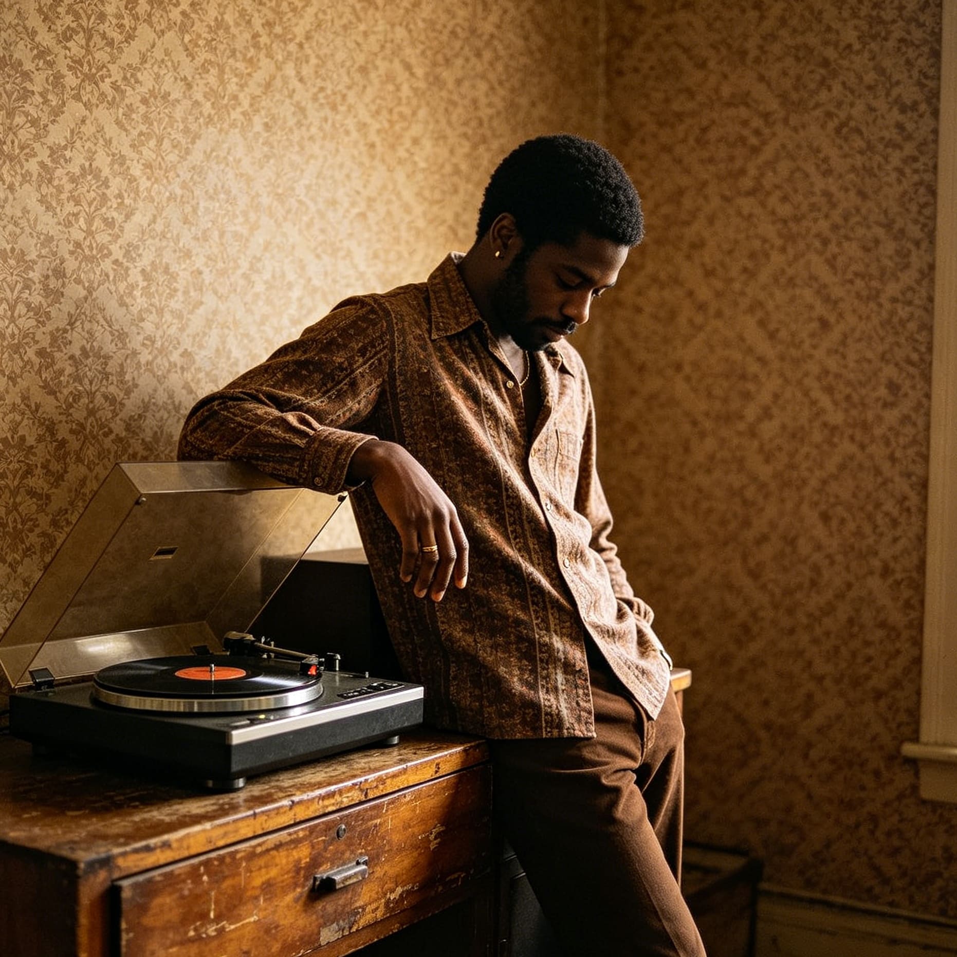
Fashion’s New Power Neutral
The fashion industry has embraced neon beige color as a versatile alternative to ivory and camel. In 2026, we are seeing this shade dominate both streetwear and formal attire.
- Outerwear: Neon beige trench coats and overcoats offer a futuristic twist on a wardrobe staple. The slight glow of the fabric—often achieved through technical blends of silk and recycled synthetics—makes the wearer stand out in a crowded urban environment without the jarring effect of primary neon colors.
- Monochromatic Styling: The most effective way to wear neon beige is in a monochromatic stack. Layering different textures of the same color—a neon beige silk shirt under a matte wool blazer—creates a sophisticated depth. This approach is highly recommended for professional settings where one wants to appear modern but remains approachable.
- Footwear: We see a significant trend in sneakers and boots using neon beige. It stays cleaner than white but feels more intentional than standard tan. It serves as an excellent bridge between colorful athletic wear and neutral casual wear.
Branding and Digital Media Applications
For brands, neon beige color offers a unique positioning. It communicates a sense of "innovative heritage." A brand using this color appears established yet technologically savvy.
In web design, neon beige is an excellent choice for background colors. It has a higher readability score for black or dark charcoal text compared to stark white, which can cause eye strain. Furthermore, it gives a website a premium, editorial feel. High-end skincare brands and sustainable tech companies have been early adopters, utilizing the color to signify purity, light, and advanced science.
Effective Color Pairings for Neon Beige
To maximize the impact of neon beige color, the surrounding palette must be carefully curated. While it is a neutral, its luminous quality means it can clash if paired with the wrong undertones.
- The High-Contrast Duo: Neon Beige and Midnight Navy. This is a classic 2026 pairing. The deep, cool tones of navy provide a perfect anchor for the glowing warmth of neon beige. This works exceptionally well in living rooms and branding logos.
- The Earthy Trio: Neon Beige, Terracotta, and Sage Green. This combination leans into the "Biophilic Neon" trend. It feels like a futuristic forest. The neon beige acts as the light filtering through the trees, while the terracotta and sage provide the grounding elements.
- The Modern Luxe: Neon Beige and Charcoal Grey. For a sleek, professional look, charcoal provides a sophisticated contrast that doesn't feel as harsh as pure black. This allows the neon beige to truly shine as the primary "light source" in the design.
- The Soft Glow: Neon Beige and Dusty Rose. This is a more romantic, softer palette. It is frequently used in bedroom design and lifestyle branding to create a sense of serenity and warmth.
The Role of Lighting and Environment
The perception of neon beige color is heavily dependent on the light source. Because the color is designed to be luminous, it is highly sensitive to the Color Rendering Index (CRI) of light bulbs.
- Natural Light: South-facing rooms will bring out the warm, orange-yellow undertones of neon beige, making it feel very energetic. North-facing rooms may make it look slightly more muted, which can be compensated for by using warmer interior lighting.
- Artificial Light: For the best results, use "warm white" LEDs (around 3000K). Avoid "cool white" or daylight bulbs (above 5000K), as they can strip the color of its warmth and make it appear a bit sickly or yellow-green.
Texture also plays a vital role. On a smooth, glossy surface, neon beige can look like liquid gold or cream. On a rough, matte surface, it looks like sun-baked clay. Designers often suggest mixing these textures within a single space to create a multi-dimensional experience of the color.
Maintenance and Practicality
While neon beige color is aesthetically superior to traditional beige, it does require some practical considerations. In interior applications, high-traffic areas should use paints with a washable sheen, as the brightness of the color can make scuffs or dirt more visible than a darker tan might.
In fashion, neon beige is surprisingly forgiving. Unlike pure white, which shows every speck of dust, the slight yellow/orange undertone of neon beige hides minor imperfections better. However, it still requires proper care—especially in high-end fabrics like silk or cashmere—to maintain its "glow."
Conclusion: The Longevity of the Neon Beige Trend
Neon beige color is more than a passing fad; it is an evolution of how we perceive neutral spaces. It solves the primary problem of the minimalist movement: the lack of soul and energy. By infusing a standard neutral with a sense of light, neon beige allows us to create environments that are both peaceful and invigorating.
Whether you are looking to refresh a living room, update a brand identity, or invest in a new wardrobe, neon beige offers a sophisticated, modern solution. It respects the past while firmly looking toward a luminous, digital future. As we move further into 2026, expect to see this shade become the defining neutral of the decade, proving that beige was never boring—it just needed a bit of light.
-
Topic: Color #FEE894 - Neon Beige | Description, Color Codes, Hues, Tints, Shades & Morehttps://colorabacus.com/color.php?hex_code=FEE894
-
Topic: 20 Types of Neon Beige - Colorguide.orghttps://colorguide.org/en/neon-beige
-
Topic: Neon Beige Color Specification - Colorguide.orghttps://colorguide.org/color/neon-beige