Home
Home
Periwinkle Blue Color: The Calm Hue Dominating Modern Design

Periwinkle Blue Color: The Calm Hue Dominating Modern Design
Periwinkle blue color occupies a unique space in the visible spectrum, sitting delicately between the cool tranquility of blue and the whimsical energy of violet. Often described as a lavender-blue or a pale indigo, it is a shade defined by its soft, hazy quality and a subtle grayish undertone that prevents it from becoming overly vibrant. This color derives its name from the lesser periwinkle herb (Vinca minor), a resilient plant known for its star-shaped blossoms that have inspired artists and designers for centuries. In 2026, periwinkle blue has moved beyond its traditional roots in nurseries and floral arrangements to become a cornerstone of sophisticated, tech-forward aesthetics and mindful interior design.
Understanding the Technical Anatomy of Periwinkle Blue
To effectively use periwinkle blue color in professional design, one must understand its digital and physical composition. It is not a primary color but a complex blend that requires precise balance to avoid leaning too heavily into pink or standard sky blue.
The Digital Spectrum
In the digital world, the most common hex triplet for a "true" periwinkle is #CCCCFF. However, modern design often utilizes variations that adjust for screen brightness and user experience (UX) requirements.
- Standard Periwinkle (Hex: #CCCCFF): This is the classic, balanced lavender-blue. It features an RGB composition of (204, 204, 255), meaning the blue component is at maximum intensity while red and green are kept at a high, equal level to provide the necessary paleness and warmth.
- Vibrant Periwinkle (Hex: #C6C9FB): A version with higher saturation (around 87%) and a slightly cooler lean, frequently used in contemporary branding to evoke a sense of innovation and freshness.
- Deep Periwinkle (Hex: #8080FF): A more saturated version that maintains the lavender undertone but provides more visual weight, ideal for accents or call-to-action buttons.
Printing and Physical Media
For print applications using the CMYK model, periwinkle blue typically requires a significant percentage of cyan and magenta with a very low or zero percentage of yellow. A standard mix might look like Cyan 21%, Magenta 20%, Yellow 0%, and Black 2%. This specific combination ensures the color retains its cool, airy feel without turning muddy or overly purple on the page.
The Psychology and Symbolism of Periwinkle
Periwinkle blue color is deeply rooted in human psychology, often associated with serenity, calmness, and the concept of "flow." Unlike bold navy blues which represent authority, or bright violets which suggest luxury and mystery, periwinkle is the color of approachability and mental clarity.
Calmness and Creativity
In color therapy, periwinkle is used to reduce stress levels and encourage clear-headed thinking. Its blue base provides a grounding effect, while the violet undertones stimulate the imaginative centers of the brain. This makes it a preferred choice for creative workspaces or home offices where high-pressure tasks are common. It suggests a state of "quiet productivity" rather than frantic energy.
Cultural Significance and Awareness
Historically, the color has held diverse meanings. In certain Eastern cultures, it has been linked to immortality and endurance. In the Victorian era, periwinkle blossoms were exchanged as tokens of blossoming friendship and sentimental memories.
In the modern era, the periwinkle ribbon serves as a vital symbol of awareness for several causes, including esophageal and stomach cancer, as well as pulmonary hypertension. Its presence in these contexts provides a visual representation of hope and peaceful resilience, further cementing its role as a color of comfort.
Integrating Periwinkle Blue Color into Interior Design
As of 2026, periwinkle blue has transitioned into a versatile neutral. It is no longer confined to small accents; it is now used as a foundation for entire rooms, providing a sophisticated alternative to gray or beige.
Living Spaces: The New Neutral
Using periwinkle blue on walls in a living room can transform the atmosphere. Because it reflects light in a soft, diffused manner, it can make small rooms feel more spacious without the starkness of pure white.
- Textural Contrast: When painting walls periwinkle, designers often suggest incorporating warm materials like light oak, rattan, or brass fixtures. The warmth of these materials balances the cool nature of the paint, preventing the room from feeling "icy."
- Lighting Considerations: Periwinkle is highly sensitive to light temperature. Under warm, incandescent lighting, the violet tones will become more prominent, giving the room a cozy, intimate feel. In natural morning light, the blue tones dominate, creating a crisp and energizing environment. Always test a patch on different walls to see how the hue shifts throughout the day.
The Kitchen and Dining Area
While blue was historically avoided in dining areas due to its alleged appetite-suppressant qualities, the lavender-leaning periwinkle is an exception. It pairs beautifully with white marble countertops and stainless steel appliances. A periwinkle blue kitchen island serves as a stunning focal point against a backdrop of neutral cabinetry, offering a pop of color that feels timeless rather than trendy.
Bedrooms and Sanctuaries
For bedrooms, periwinkle blue is perhaps the most recommended hue for promoting sleep hygiene. It lowers the visual "noise" of a room. Designers often employ a monochromatic palette here, using various shades of periwinkle—from a faint lavender mist on the ceiling to a deep periwinkle velvet for the headboard. This layering creates a cocoon-like effect that is conducive to relaxation.
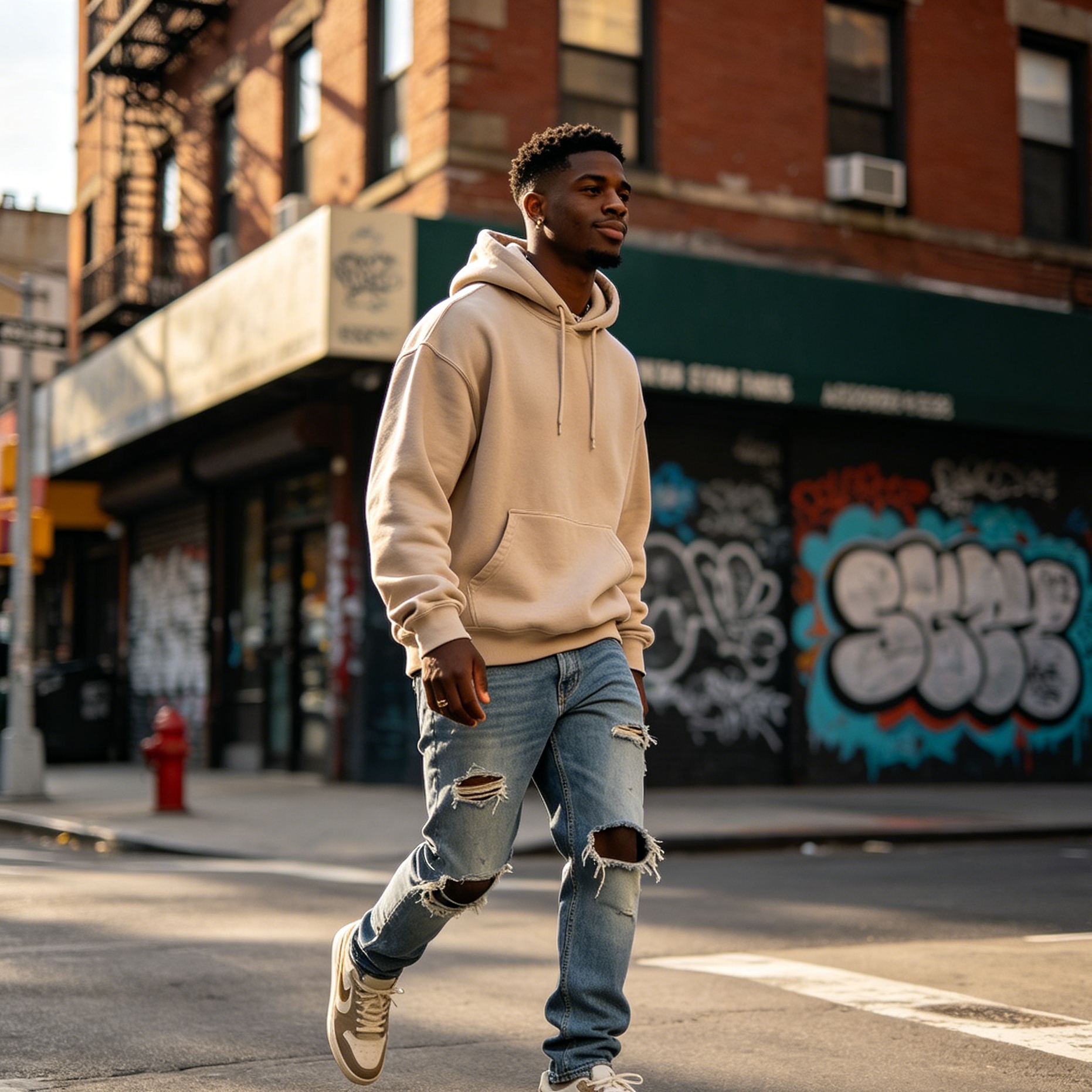
Fashion and Beauty Trends in 2026
In the world of fashion, periwinkle blue color has emerged as a gender-neutral staple. Its ability to complement a wide range of skin tones—from very fair to deep ebony—makes it a favorite for designers looking for inclusivity.
Fabric and Texture
The impact of periwinkle blue changes significantly with the choice of fabric.
- Silk and Satin: In these reflective materials, periwinkle takes on a futuristic, ethereal quality. It is a popular choice for evening wear and formal gowns in 2026, often paired with silver or iridescent accessories.
- Knitwear and Wool: In matte, heavy textures, the color becomes earthy and comforting. A chunky periwinkle sweater paired with charcoal trousers is a quintessential "smart-casual" look.
- Activewear: The color’s association with calmness has made it a dominant force in the yoga and wellness apparel market. It provides a visual cue for mindfulness during physical practice.
Beauty and Cosmetics
In the beauty industry, periwinkle is no longer a "daring" color but a sophisticated one. Periwinkle-toned eyeliners and eyeshadows are used to brighten the eyes, especially when paired with neutral brown or taupe transitions. Similarly, periwinkle nail polish has become a year-round favorite, offering a clean, modern look that is more interesting than standard nude shades but more professional than neon blues.
How to Mix and Pair Periwinkle Blue
For artists and DIY enthusiasts, creating the perfect periwinkle blue color at home requires a bit of color theory knowledge.
The Mixing Formula
Instead of simply mixing blue and purple, which can result in a dark, muddy indigo, follow this stepped approach:
- Start with White: Use a generous base of white paint. Periwinkle is essentially a pastel, and it is easier to darken a light base than to lighten a dark one.
- Add a Pure Blue: Incorporate a light, cool blue (like a sky blue or cerulean) into the white until you reach a pale blue shade.
- The Violet Touch: Add a very small amount of warm red or a pre-mixed violet. The goal is to "pull" the blue toward the purple side of the wheel without losing the blue identity.
- The Secret Ingredient: To achieve the "hazy" quality of true periwinkle, add a tiny drop of gray or a complementary soft orange. This desaturates the color just enough to give it that sophisticated, dusty look.
Effective Color Palettes
Periwinkle is a team player in the world of color schemes. Here are some of the most effective pairings for 2026:
- The Complementary Contrast (Periwinkle + Soft Peach): Sitting nearly opposite on the color wheel, this pairing is vibrant and cheerful. It is frequently used in branding for wellness and lifestyle products.
- The Analogous Harmony (Periwinkle + Mint Green + Lilac): Using colors that are neighbors on the wheel creates a serene, garden-like atmosphere. This is ideal for spring-themed events or nursery decor.
- The Sophisticated Trio (Periwinkle + Slate Gray + Navy): This monochromatic and neutral blend is perfect for professional environments and masculine fashion, offering depth without being overly colorful.
- The High-Contrast Duo (Periwinkle + Terracotta): The earthiness of burnt orange/terracotta grounds the airiness of periwinkle, creating a balanced, modern-bohemian aesthetic.
Digital Strategy and Branding
In 2026, digital interfaces are moving away from the harsh "tech blue" of the early 2010s. Brands are looking for colors that feel more human and less clinical. Periwinkle blue color is the perfect solution.
UI/UX Design
Periwinkle is increasingly used as a primary brand color for apps focused on mental health, education, and social connection. It has high legibility when paired with black or dark gray text, meeting most web accessibility standards (WCAG). Its soft nature also reduces screen fatigue, making it a better choice for long-form reading platforms or meditation apps than high-contrast primary blues.
Logo and Brand Identity
Companies that want to convey trust (blue) but also innovation and creativity (violet) often land on periwinkle. It stands out in a crowded marketplace of navy and royal blue logos, signaling that the company is forward-thinking and approachable. When used in packaging, periwinkle suggests a premium, carefully crafted product that isn't afraid to be unique.
The Role of Sheen and Finish
When applying periwinkle blue color in a physical space, the finish of the material is just as important as the hue itself.
- Flat/Matte: Best for hiding imperfections on walls. A matte periwinkle finish looks like a soft velvet and absorbs light, making the color appear deeper and more violet. This is ideal for bedrooms and low-traffic areas.
- Eggshell/Satin: This is the "all-purpose" finish. It has a slight sheen that reflects enough light to show off the blue undertones without being distracting. It is durable enough for living rooms and hallways.
- Semi-Gloss/High-Gloss: Use these for trim, doors, or furniture. A high-gloss periwinkle cabinet or door becomes a jewel-like feature. The reflective surface makes the color appear brighter and more energetic.
Conclusion: The Timelessness of Periwinkle Blue
Periwinkle blue color is far more than a passing trend. It is a versatile, emotionally resonant hue that bridges the gap between the natural world and our increasingly digital existence. Whether it’s the star-shaped flower in a spring garden, the calming walls of a modern bedroom, or the sleek interface of a new app, periwinkle provides a sense of balance that is rare in the color spectrum. By understanding how to mix, pair, and apply this shade, designers and homeowners can create spaces and products that are not only visually stunning but also psychologically supportive. As we move further into 2026, expect to see this "lavender-blue" continue its ascent as a defining color of a more mindful and creative era.
-
Topic: Periwinkle (color) - Wikipediahttps://en.wikipedia.org/wiki/Periwinkle_blue
-
Topic: Periwinkle (color) - Simple English Wikipedia, the free encyclopediahttps://simple.wikipedia.org/wiki/Periwinkle_(color)
-
Topic: How to Make the Color Periwinkle | Hunkerhttps://www.hunker.com/12002157/how-to-make-the-color-periwinkle