Home
Home
Periwinkle Blue: Why This Dreamy Shade Is a 2026 Essential
Periwinkle Blue: Why This Dreamy Shade is a 2026 Essential
Periwinkle blue occupies a unique, almost ethereal space in the visible spectrum. Neither fully blue nor entirely violet, it represents a delicate equilibrium between the calmness of the sky and the energetic undertones of purple. In 2026, as digital aesthetics increasingly blend with organic textures, this specific hue has emerged as a cornerstone for designers seeking to evoke a sense of "digital serenity." It is a color that feels both futuristic and nostalgic, grounded in the natural world through the Vinca minor flower yet elevated by its frequent use in high-tech interfaces and modern minimalist branding.
Defining the periwinkle blue color requires an understanding of its subtle nuances. It is characterized by a soft, hazy quality—often possessing a grayish undertone that prevents it from feeling overly saturated or aggressive. This atmospheric quality makes it incredibly versatile, functioning as a sophisticated alternative to basic pastels. Whether it is applied to a high-gloss tech gadget or a linen textile, periwinkle blue maintains a consistent identity of intelligence, tranquility, and refined taste.
The Technical Identity of Periwinkle Blue
To work effectively with periwinkle blue, one must look beyond the visual impression and into the precise data that defines it across various systems. Depending on the specific application—be it digital screen design or physical manufacturing—the coordinates for periwinkle blue can vary slightly, but a core standard exists.
Digital Specifications (RGB and HEX)
The most widely recognized version of periwinkle blue in digital design often centers around the hex code #8F99FB. This specific iteration is vibrant yet light, belonging to a family of blues that lean heavily into the violet spectrum.
- HEX: #8F99FB
- RGB: (143, 153, 251)
- HSL: 234°, 93%, 77%
- HSV: 234°, 43%, 98%
In this configuration, the red component stands at approximately 56%, the green at 60%, and the blue at a dominant 98%. This high blue percentage, tempered by a significant amount of red, is exactly what gives periwinkle its characteristic "purple-blue" glow.
Another common variant, often used for a softer, more pastel effect, is #CCCCFF. This version is frequently referred to as "lavender blue" and has been a staple in web design since the early days of the internet. It offers a higher lightness level (around 85-90%), making it an ideal background color for dark text.
Print Specifications (CMYK)
Translating this luminous digital color into physical ink requires a careful balance to avoid the color looking "muddy." For a standard periwinkle blue, the CMYK breakdown typically looks like this:
- Cyan: 42%
- Magenta: 38%
- Yellow: 0%
- Black (Key): 2%
The absence of yellow is critical; even a small percentage of yellow can shift periwinkle toward a duller, greener tone, stripping away its essential violet brilliance. The slight touch of black (K) provides the necessary depth to keep the color from appearing too translucent on paper.
Historical Roots and Modern Evolution
The term "periwinkle" was first recorded as a color name in the English language in 1922, though the flower that shares its name has been a symbol in various cultures for centuries. Derived from the Vinca minor or "lesser periwinkle," the color has historically been associated with sentimental memories and everlasting love. In Victorian floral language, gifting a periwinkle blossom was a gesture of blossoming friendship.
In the mid-20th century, the color gained a permanent place in the popular imagination when Crayola added "Periwinkle" to its palette in 1949. Since then, it has transitioned from a childhood crayon color to a sophisticated tool in fashion and interior design.
By 2026, the perception of periwinkle blue has shifted again. It is no longer just a "pretty pastel." It is now viewed through the lens of "wellness tech." In a world where screen fatigue is a constant concern, periwinkle blue is used in user interfaces (UI) to provide a visual break—it is a color that doesn't demand attention but rather invites a relaxed focus. This evolution from a garden herb to a digital stabilizer highlights the color's enduring relevance.
The Psychology of Periwinkle Blue
Color psychology suggests that periwinkle blue has a profound impact on the human psyche, primarily due to its combination of blue’s stability and violet’s spiritual energy. It is often associated with the following emotional states:
- Tranquility and Peace: Like a clear twilight sky, periwinkle blue lowers the heart rate and encourages a state of rest. It is less cold than pure blue and less intense than deep purple, creating a "sweet spot" of relaxation.
- Intellectual Wisdom: The blue undertones suggest logic and trust, while the violet hints at intuition and creativity. This makes periwinkle blue a popular choice for educational platforms and innovative tech companies.
- Nostalgia and Sentimentality: Because of its history in fashion and nature, it often evokes memories of springtime, childhood, and classic elegance. It is a color that feels "safe" and familiar.
- Modern Optimism: In 2026, there is a growing trend toward colors that feel "clean" and "airy." Periwinkle blue fits this perfectly, representing a fresh start and a clear, uncluttered mind.
Mastering Periwinkle Blue Color Harmonies
Creating a palette around periwinkle blue requires an understanding of the color wheel. Because it sits between blue and violet, it can be treated as either a cool anchor or a vibrant accent depending on what it is paired with.
The Complementary Contrast
The direct complement of periwinkle blue (#8F99FB) is a warm, sunny yellow or a soft peach-orange (around #FAF18F). This pairing is highly effective because it balances the coolness of the periwinkle with a burst of warmth. In a living room setting, periwinkle walls with gold or brass accents create a luxurious, balanced atmosphere.
The Analogous Harmony
For a more cohesive and calming look, pair periwinkle with its neighbors on the color wheel:
- Cool Side: Soft sky blues and teals.
- Warm Side: Lilacs, wisterias, and lavenders. Using these colors together creates a monochromatic effect that is rich in depth without being jarring. This is a favorite strategy in modern spa design and bedroom styling.
The Triadic Palette
If you are looking for a more dynamic and energetic scheme, use a triadic approach. Pair periwinkle blue with a mint green and a soft coral or geraldine pink. This combination is particularly popular in 2026's "New Retro" design trend, which seeks to modernize the aesthetics of the 1980s and 90s with cleaner lines and softer saturations.
Neutral Pairings
Periwinkle blue truly shines when placed against neutrals:
- With White: Creates a crisp, clean, and airy feel (ideal for kitchens and bathrooms).
- With Charcoal Gray: Adds a level of professional sophistication and "moodiness" (ideal for office branding).
- With Warm Taupe: Softens the blue, making it feel more grounded and earthy.
Periwinkle Blue in 2026 Interior Design
Interior design trends in 2026 have moved away from the stark "all-white" minimalism toward "dopamine decor" and "sensory-friendly" spaces. Periwinkle blue is the perfect medium for these trends.
The "Soft Office"
As remote work continues to evolve, the home office is being redesigned to reduce stress. Painting a feature wall in periwinkle blue can help maintain focus during long video calls while providing a soothing background that doesn't distract the eye. It works exceptionally well under both natural daylight and warm LED lighting.
The Nursery and Bedroom
Traditionally, periwinkle has been a favorite for nurseries due to its gender-neutral appeal and calming effect. In 2026, this has expanded into adult bedrooms as part of the "Sleep Hygiene" movement. Bedding in periwinkle blue linen is not only aesthetically pleasing but is psychologically proven to help the brain transition into a rest state.
Accent Pieces
For those not ready to commit to a full room of color, periwinkle blue is an excellent choice for accent pieces. A periwinkle velvet armchair or a set of ceramic vases can act as a "pop" of color in a room otherwise dominated by wood tones and grays.
Digital Branding and Web Accessibility
In the digital realm, periwinkle blue is more than just an aesthetic choice; it is a functional one. Tech brands, particularly those in the AI, health-tech, and meditation space, are increasingly adopting periwinkle as their primary brand color.
Trust and Innovation
Blue has long been the color of trust (think IBM or Dell), but it can sometimes feel corporate and cold. By shifting the hue toward periwinkle, brands can maintain that sense of reliability while adding a layer of "humanity" and "innovation." It suggests a company that is forward-thinking but cares about the user's well-being.
Accessibility Considerations (WCAG)
When using periwinkle blue in web design, accessibility is a paramount concern.
- Contrast Ratios: A light periwinkle like #CCCCFF typically does not have enough contrast against white text to meet WCAG AA standards. Designers should use black or very dark navy text when placing content over a periwinkle background.
- User Experience (UX): Periwinkle is excellent for non-critical UI elements, such as secondary buttons, progress bars, or icons. It provides enough color to be distinguishable without the "urgency" of red or the "heaviness" of dark blue.
Fashion and Beauty: The 2026 Perspective
The fashion industry has embraced periwinkle blue as a year-round staple rather than just a springtime seasonal color.
Apparel
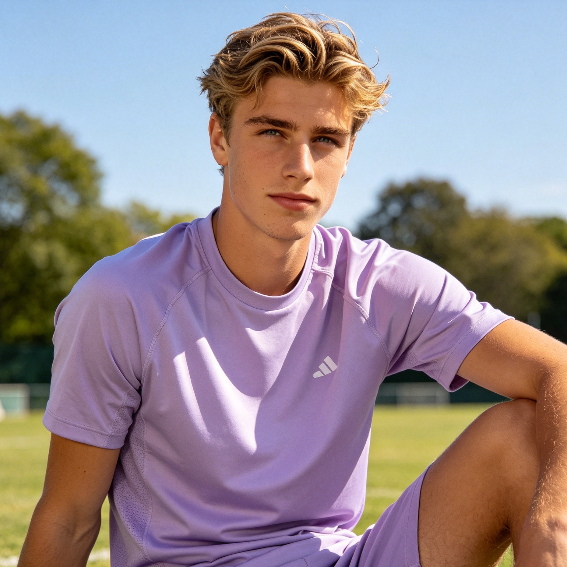
In 2026, we see a rise in "monochrome periwinkle" layering. A knit periwinkle sweater paired with tailored trousers in a slightly darker shade of the same hue creates a sophisticated, high-fashion look. The color's ability to complement almost every skin tone—due to its mix of warm red and cool blue undertones—makes it a retail favorite.
Beauty and Cosmetics
In the beauty world, periwinkle is making a comeback in eye makeup and nail art. Periwinkle eyeliner offers a softer alternative to harsh black or navy, brightening the whites of the eyes and making them appear more awake. In nail care, it is the go-to shade for the "clean girl" aesthetic with a twist, offering a more playful look than a standard nude polish.
Symbolism in Modern Culture
Beyond aesthetics, periwinkle blue carries significant weight in awareness and social causes. It is the official color for esophageal and stomach cancer awareness ribbons, as well as pulmonary hypertension. In these contexts, the color represents hope and the quiet strength of those fighting these conditions.
Furthermore, its association with "everlasting love" makes it a recurring theme in modern wedding decor. In 2026, "Periwinkle Weddings" have become a trend for couples looking to move away from traditional blush pinks and towards something more unique and intellectually grounded. From bridesmaid dresses to floral arrangements featuring the actual periwinkle flower, the color provides a whimsical yet dignified atmosphere.
Conclusion: Incorporating Periwinkle Blue into Your Life
Whether you are a professional designer or someone looking to refresh their personal space, periwinkle blue offers a wealth of possibilities. It is a color that rewards experimentation.
To start, consider small changes:
- Swap out standard white lightbulbs for "smart bulbs" that can project a periwinkle glow during your evening wind-down.
- Introduce a periwinkle blue scarf or tie into your wardrobe to see how the color interacts with your existing pieces.
- Experiment with periwinkle in your digital workspaces—change your folder icons or desktop wallpaper to this hue to observe its effect on your productivity and mood.
Periwinkle blue is more than a fleeting trend. It is a reflection of our collective desire for a world that is technologically advanced yet emotionally resonant. By understanding its technical properties, psychological impact, and design potential, you can harness the power of this dreamy shade to create spaces and products that are truly timeless.
Frequently Asked Questions about Periwinkle Blue
Is periwinkle blue more blue or more purple? While it sits between the two, periwinkle is technically classified as a "pale tint of blue-violet." It has a blue base, but the significant presence of red/violet is what defines its unique character. In most color systems, it is categorized under the blue family.
What colors look best with periwinkle blue? Complementary colors like soft yellow, peach, and coral provide the best contrast. For a more harmonious look, pair it with lavender, mint green, or cool grays.
What is the hex code for periwinkle blue? The most popular hex code for periwinkle blue is #8F99FB, though lighter versions like #CCCCFF are also commonly used in design.
Is periwinkle blue a warm or cool color? Periwinkle blue is considered a cool color. However, because it contains red undertones (which create the violet shift), it is "warmer" than a true sky blue or navy, giving it a comforting quality that many other cool colors lack.
-
Topic: Periwinkle (color) - Wikipediahttps://en.wikipedia.org/wiki/Periwinkle_blue
-
Topic: Periwinkle Blue color - #8F99FB - The Official Register of Color Nameshttps://color-register.org/color/periwinkle-blue
-
Topic: What does periwinkle blue look like?https://www.colorwithleo.com/what-does-periwinkle-blue-look-like/