Home
Home
Picking Valentine's Day Images That Don't Look Like Every Other Card
Picking Valentine's Day Images That Don't Look Like Every Other Card
Visual communication serves as the primary bridge for human connection in the digital age. When February approaches, the demand for visual content surges, yet many creators fall into the trap of repetitive aesthetics. Choosing the right Valentine's Day images requires moving beyond the surface-level tropes of glitter and neon red. It involves understanding the subtle shifts in modern romance, the psychology of color, and the technical requirements of different digital platforms. As visual standards evolve, the imagery used to represent love must reflect a more nuanced, diverse, and authentic reality.
The Shift Toward Authentic Romanticism
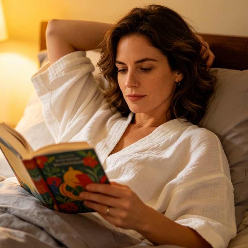
For decades, Valentine's Day images were defined by a very specific, often rigid set of criteria: perfectly posed couples, bright red roses with dew drops, and symmetrical heart shapes. However, current visual trends show a definitive pivot toward "staged authenticity." This means photos that look like candid moments caught on film rather than a high-budget studio production.
Modern audiences respond more favorably to images that feel lived-in. This includes photographs featuring slightly messy breakfast-in-bed scenes, blurred motion shots of a couple laughing, or hands intertwined with imperfect lighting. The goal is no longer to portray a fantasy of love, but rather a relatable version of it. When selecting imagery for 2026, prioritize shots that capture micro-expressions—the slight crinkle of eyes during a laugh or the casual way someone holds a coffee mug—as these details build trust and emotional resonance with the viewer.
Beyond Red: The New Color Palettes of Love
While red remains the legacy color of the season, it is no longer the sole contender. In fact, over-reliance on primary red can often make a design look dated or overly commercial. Modern Valentine's Day images are increasingly embracing a broader spectrum of hues that convey different facets of affection.
- Lavender and Lilac: These shades suggest a softer, more whimsical form of romance. They are particularly effective for youth-oriented or wellness-focused content. Lavender evokes a sense of calm and mystery, moving away from the intensity of red toward a more contemplative space.
- Terracotta and Earth Tones: Reflecting a broader trend in interior design and fashion, earthy pinks and muted oranges are becoming staples in romantic photography. These colors feel grounded and mature, suggesting a love that is stable and enduring rather than fleeting and passionate.
- Monochromatic Minimalism: Using varying shades of a single color (like a deep burgundy paired with a pale blush) creates a sophisticated, high-end feel. This approach is highly effective for luxury branding or minimalist social media grids.
- Sage Green and Butter Yellow: These unexpected additions bring a "springtime of love" feeling. They work exceptionally well for lifestyle imagery involving picnics, flower markets, or outdoor dates.
The Rise of Diverse Representation in Visuals
One of the most significant improvements in the landscape of Valentine's Day images is the expansion of what a "couple" or "love" looks like. Visual content now recognizes that love is not a monolith. High-quality image libraries are now filled with representations of intergenerational love, LGBTQ+ relationships, and multi-ethnic families.
Beyond romantic partners, there is a growing trend toward "Galentine's" and "Palentine's" imagery—celebrating platonic friendships. Images of groups of friends sharing a meal or a dog curled up next to its owner are just as relevant in February as traditional romantic shots. When curating images, ensuring that the collection reflects a wide array of human experiences is not just a matter of inclusivity; it is a matter of accuracy in reflecting the modern world. Content that fails to represent this diversity often feels out of touch and loses its impact.
Texture and Medium: Photography vs. 3D Renders
The medium through which an image is created dictates its tone. In the current landscape, two distinct styles are competing for dominance: ultra-realistic film photography and stylized 3D digital art.
The Film Aesthetic
There is a massive resurgence in imagery that mimics analog film. These images are characterized by visible grain, light leaks, and a slightly warm or cool tint. This style works because it feels nostalgic. In an era of high-definition digital perfection, the flaws in film-style images provide a sense of soul and history. For personal blogs or intimate brand storytelling, these are often the best choice.
3D and Y2K Graphics
On the other end of the spectrum is the vibrant, 3D-rendered aesthetic influenced by the late 90s and early 2000s (Y2K). These images often feature glossy heart shapes, chrome textures, and bold typography. This style is highly effective for high-energy marketing, event posters, and tech-forward platforms. It moves away from the "natural" and leans into the "fun," making it perfect for capturing the attention of younger demographics who appreciate a bit of irony and maximalism in their visuals.
Composition and the Use of Negative Space
A common mistake when choosing Valentine's Day images is picking photos that are too "busy." If an image is intended to be used as a background for text—such as an invitation, a social media post, or a website banner—composition is critical.
Images with significant "negative space" (empty areas like a blank wall, a clear sky, or a flat tabletop) are essential. For example, a top-down shot of a wooden table with a single cup of coffee and a small heart-shaped cookie in the corner provides ample room for a meaningful quote or a promotional message. The focal point should be clear but not overwhelming. This "breathing room" allows the viewer's eye to rest and ensures that any overlaid information is legible.
The Role of Lifestyle and Object-Based Imagery
Sometimes, the most powerful Valentine's Day image doesn't feature people at all. Object-based storytelling allows the viewer to project themselves into the scene.
- Food and Drink: A heart-shaped pizza, two glasses of champagne with bubbles rising, or a stack of pancakes topped with strawberries. These images evoke the experience of a date without the distraction of specific models.
- Nature and Florals: Moving beyond the standard bouquet, consider close-ups of specific textures—the velvet-like petal of a dark rose, the intricate patterns of a dried flower arrangement, or sunlight filtering through leaves.
- Interior Spaces: A cozy corner with a soft blanket, a candle flickering, and an open book. These images tap into the "Coziness" or "Hygge" trend, emphasizing the comfort found in companionship.
Technical Considerations for High-Quality Visuals
Selecting a beautiful image is only half the battle; ensuring it functions correctly in a digital environment is the other.
- Resolution and Scaling: For header images and print materials, high-resolution files (at least 300 DPI for print or 2000+ pixels for web) are non-negotiable. Using a low-quality, pixelated image instantly devalues the message, regardless of how good the subject matter is.
- Aspect Ratios: Vertical images (9:16) are the standard for mobile-first content like stories and reels, while horizontal (16:9) remains king for desktop banners and traditional cinematic storytelling. Square images (1:1) are still the safest bet for general social media feed consistency.
- Licensing and Originality: While stock photos are a great resource, excessive use of the most popular free images can make a brand look generic. It is often worth looking into premium collections or even commissioning original photography to ensure the visuals aren't appearing on every other website simultaneously.
Identifying and Avoiding Visual Clichés
To stand out, one must know what to avoid. Certain visual metaphors have been used so frequently that they no longer register with the audience.
- The "Hand Heart": While classic, it has become one of the most overused gestures in stock photography. Unless the lighting or context is exceptionally unique, it often feels like filler.
- Perfectly Symmetrical Rose Petals on a Bed: This often feels more like a hotel advertisement than a genuine expression of love.
- Generic Icons: Flat, red vector hearts with no shadow or texture often look like clip art from twenty years ago. If using vectors, look for those with hand-drawn qualities, gradients, or 3D depth.
Instead of these clichés, look for "unexpected pairings." An image of a rugged mountain landscape with two small camping chairs, or a gritty city street at night with a single neon heart in a window, tells a far more compelling and modern story than a standard studio setup.
Future-Proofing Your Visual Strategy
As we move further into 2026, the intersection of technology and human emotion will continue to shape how we view Valentine's Day. We are seeing a rise in "Surrealist Romance"—images that use digital manipulation to create dream-like, impossible scenes (e.g., giant floating flowers in a city square). This reflects a desire for escapism and wonder.
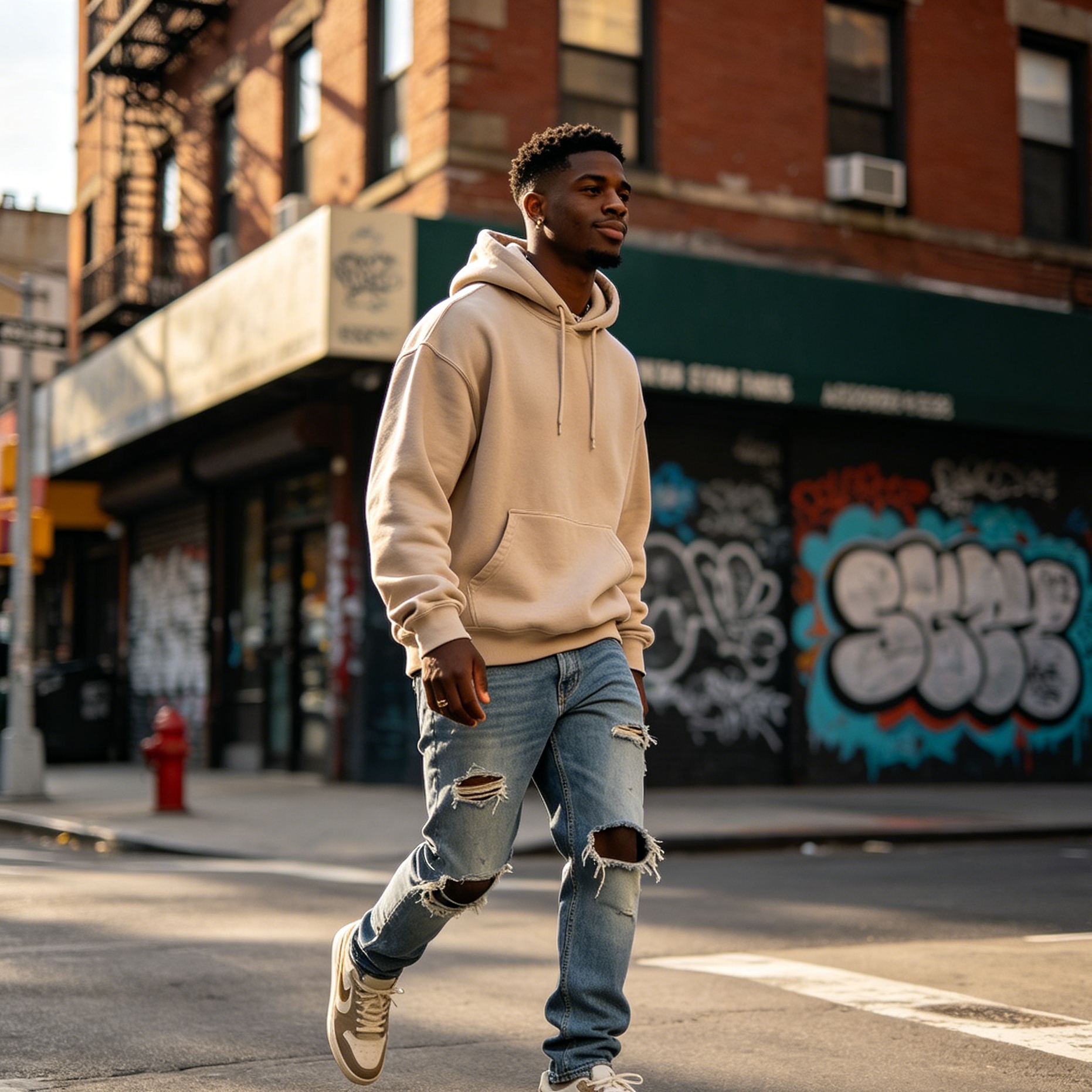
At the same time, there is a push for "Hyper-Local" imagery. People want to see scenes that look like their own neighborhoods and lifestyles. Images featuring local architecture, regional food specialties, and recognizable cultural motifs are becoming more popular than the "anywhere USA" style of traditional stock media.
The Psychological Impact of Lighting
Lighting is the most effective tool for setting the mood of a Valentine's Day image.
- Golden Hour: The soft, warm light of a sunset creates a feeling of romance and optimism. It is the go-to for outdoor engagement or lifestyle shots.
- Low-Key / Moody Lighting: Deep shadows and single light sources (like candlelight) create intimacy and drama. This is excellent for high-end dining or sophisticated evening themes.
- High-Key / Airy Lighting: Bright, white, and clean lighting suggests freshness and new beginnings. This is perfect for morning scenes, breakfast-themed content, or youth-focused brands.
Conclusion: Visuals as an Emotional Anchor
In the end, the goal of searching for Valentine's Day images is to find a visual anchor for an emotional message. Whether the intent is to sell a product, share a personal story, or simply brighten someone's day, the image is the first thing the viewer interacts with. By choosing visuals that are authentic, diversely representative, and technically sound, you elevate the conversation from a commercial obligation to a genuine connection. The trend for the mid-2020s is clear: move away from the plastic and toward the personal. The best images are not the ones that are the most "perfect," but the ones that feel the most "true."
-
Topic: 1,476,800+ Valentines Day Stock Photos, Pictures & Royalty-Free Images - iStockhttps://www.istockphoto.com/photos/valentines-day?page=4
-
Topic: 143,866 Valentines Day Stock Photos, High-Res Pictures, and Images - Getty Images | Valentines day background, Happy valentines day, Valentines day dinnerhttps://www.gettyimages.com/photos/valentines-day?sort=newest
-
Topic: 143,868 Valentine´S Day Stock Photos, High-Res Pictures, and Images - Getty Images | Love, Valentine's day, Valentine cardhttps://www.gettyimages.com/photos/valentine%C2%B4s-day?page=3