Home
Home
Rose Pink Color: Why This Shade Is Dominating 2026 Design

Rose Pink Color: Why This Shade Is Dominating 2026 Design
Rose pink color sits at a unique intersection of organic warmth and digital vibrance. Identified by the hex code #FF66CC, this particular shade is not merely a lighter version of red; it is a tertiary hue that balances the intensity of magenta with the softness of a classic blush. In the current design landscape of 2026, rose pink has moved beyond its historical gendered associations to become a powerhouse of versatility in branding, interior aesthetics, and digital interfaces.
The Technical Identity of #FF66CC
Understanding rose pink color requires a deep dive into its numerical DNA. In the RGB color model, which is the standard for digital screens, #FF66CC is composed of 100% red, 40% green, and 80% blue. This high red content provides its inherent warmth, while the substantial blue component prevents it from leaning too far into the orange or peach spectrum, giving it that characteristic "cool" rosy undertone.
From a CMYK perspective—essential for physical printing—the composition shifts to approximately 0% cyan, 60% magenta, 20% yellow, and 0% black. The dominance of magenta combined with a touch of yellow creates a luminous quality that is difficult to replicate with simpler pinks. In terms of HSL (Hue, Saturation, Lightness), rose pink sits at 320°, with 100% saturation and 70% lightness. This high saturation ensures the color remains impactful even in small accents, while the 70% lightness keeps it airy and approachable.
Historical Evolution: From 1760 to 2026
The term "rose pink" first appeared in the English language as a color name around 1760. During the 18th century, it was a shade favored by the aristocracy, symbolizing luxury and the delicate beauty of old garden roses like the Gallica and Centifolia varieties. Unlike the mass-produced synthetic dyes of the later 20th century, the original rose pink was a subtle, naturalistic pigment.
As we navigate 2026, the perception of rose pink has undergone a radical transformation. In the mid-20th century, it was confined to domestic spheres and traditional femininity. However, the current era has reclaimed it as a "mood" color rather than a "gender" color. Today, it is used to represent empathy, mental clarity, and a sophisticated rebellion against the stark, cold minimalism of the early 2020s. It is no longer just a color for floral patterns; it is the color of high-tech startups, architectural glass, and sustainable fashion lines.
The Psychological Impact of Rose Pink
Color psychology suggests that rose pink color strikes a balance between the physical energy of red and the quiet introspection of violet. It lacks the aggression of pure red but retains its passion. In 2026, a year characterized by a global push toward "soft living" and biophilic integration, rose pink serves as a visual balm.
- Compassion and Connection: The warmth in #FF66CC fosters a sense of approachability. Brands using this shade often want to communicate a commitment to community and ethical practice.
- Sophisticated Optimism: Unlike "Hot Pink," which can be overstimulating, rose pink offers a grounded form of positivity. It suggests that things are getting better without being naive.
- Focus and Calm: In interior environments, specifically workspace design, rose pink has been found to reduce perceived stress levels compared to stark white or grey, without inducing the lethargy associated with darker blues.
Rose Pink vs. The Pink Spectrum
To truly utilize rose pink color, one must distinguish it from its many cousins. It is frequently confused with other shades, but the differences are critical for design precision:
- Rose Pink vs. Baby Pink: Baby pink is much cooler and contains more white. It often feels juvenile, whereas rose pink has a sophisticated depth due to its higher red and blue saturation.
- Rose Pink vs. Fuchsia: Fuchsia is significantly darker and more purple. While fuchsia demands attention through intensity, rose pink attracts through its luminosity.
- Rose Pink vs. Salmon or Coral: These shades are heavily influenced by orange. Rose pink maintains a strict purplish-red base, making it look much cleaner when paired with cool tones like silver or mint.
- Rose Pink vs. Dusty Rose: Dusty rose is a muted, desaturated version of the hue. In 2026, while dusty rose is seen as "vintage" or "retro," the vibrant rose pink of #FF66CC is viewed as "future-forward" and digital-ready.
Interior Design in 2026: The "Rosy Room" Concept
In the current residential design cycle, we are seeing a move toward "drenched environments." This involves using variations of a single color across different textures in a room. Rose pink color is the perfect candidate for this because of how it reacts to light.
Living Spaces
In a living room, a rose pink velvet sofa acts as a neutral when paired with natural oak flooring and sage green walls. Because the color contains both warm and cool elements, it bridges the gap between different materials. Designers are increasingly using rose pink limewash on walls to create a Mediterranean, sun-drenched effect that feels both ancient and modern.
Kitchens and Bathrooms
The 2026 trend for kitchens involves "soft utility." We see rose pink being used in matte finishes for cabinetry, paired with brushed copper hardware. In bathrooms, rose pink tiles—specifically in kit-kat or sub-way formats—provide a refreshing alternative to the clinical look of white marble. It warms up the space, making the morning routine feel more like a ritual than a chore.
Fashion and the 2026 Aesthetic
This spring, fashion runways have pivoted toward "Hyper-Romanticism." Rose pink color is at the center of this movement, appearing in structured blazers, sheer overlays, and even technical outerwear. The key to wearing it now is contrast. Instead of the "Barbiecore" head-to-toe look of a few years ago, the 2026 approach is to pair rose pink with "ugly" colors—browns, olives, and charcoals.
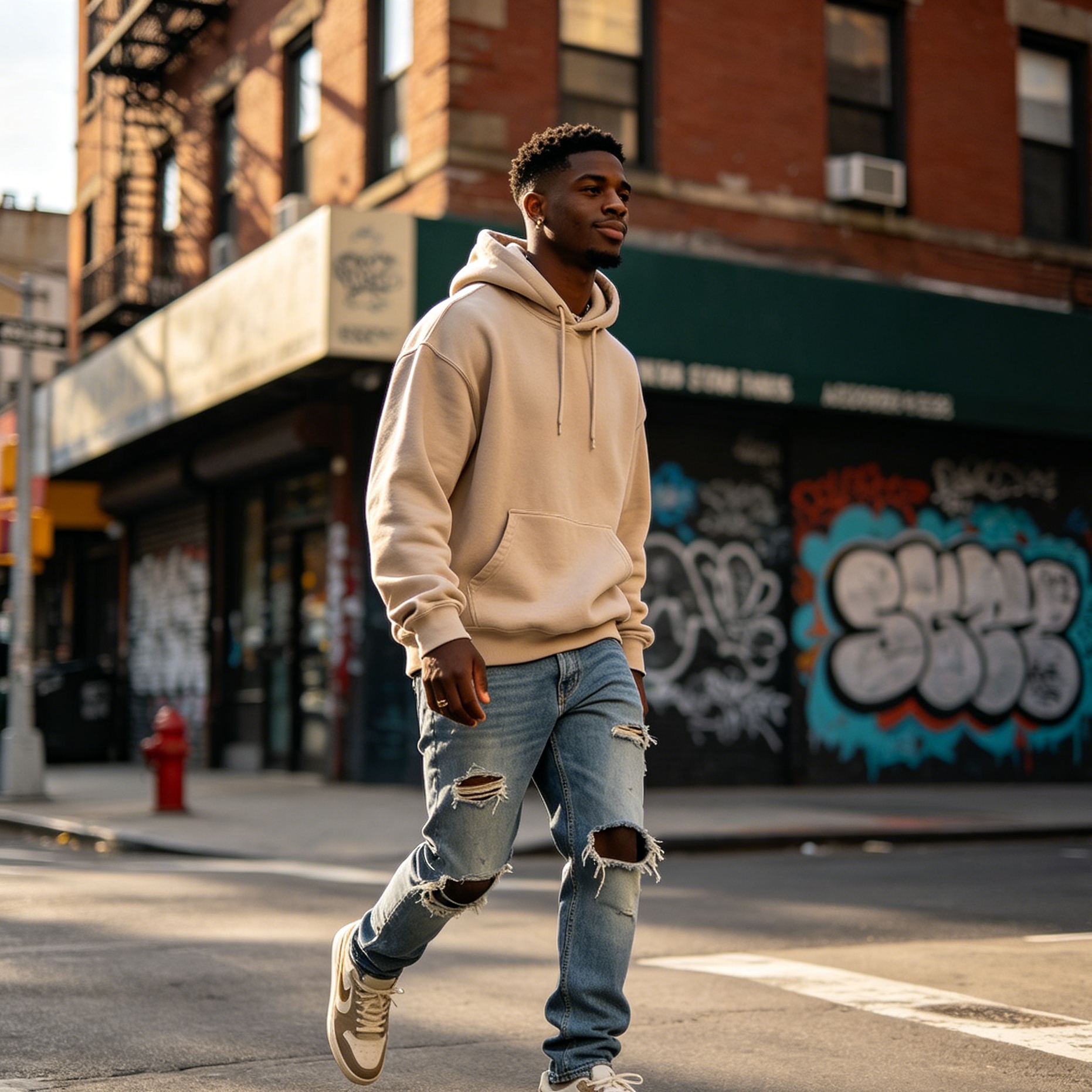
In men's fashion, rose pink has become a staple for linen suits and knitwear. It is celebrated for its ability to flatter almost all skin tones, bringing a healthy, vibrant glow to the wearer. The color’s presence in footwear, particularly in high-performance running shoes and hiking gear, highlights its transition into the "lifestyle and wellness" sector.
Digital Branding and UI Design
For digital products, #FF66CC offers high legibility and an "app-friendly" vibe. It is a favorite for Fintech and Healthtech companies in 2026 because it breaks the "blue wall" of traditional corporate branding. When used as an accent color for Call-to-Action (CTA) buttons, rose pink provides a high conversion rate because it stands out against both dark and light modes without the "warning" association of red.
In web design, the use of rose pink gradients—fading from a deep rose to a pale lavender—creates a sense of depth and motion. It is a color that feels native to high-resolution OLED screens, where its saturation can truly shine.
Mastering the Rose Pink Palette
Creating a balanced palette around rose pink color requires an understanding of color theory. Here are the most effective combinations for 2026:
The Complementary Duo: Rose Pink and Mint Green
Since green is the opposite of red on the color wheel, a soft mint or seafoam green provides a striking contrast. This combination is ubiquitous in 2026 packaging design, especially for organic beauty products and high-end confectionery. It feels fresh, spring-like, and balanced.
The Sophisticated Trio: Rose Pink, Navy Blue, and Champagne Gold
For a more formal application, such as wedding branding or luxury hotel interiors, rose pink should be anchored by a dark neutral. Navy blue provides the weight, while rose pink adds the soul. Champagne gold accents provide a metallic shimmer that elevates the entire look.
The Analogous Harmony: Rose Pink, Lavender, and Burgundy
Using colors that sit next to each other on the wheel creates a low-contrast, soothing effect. This palette is ideal for meditation apps, bedroom textiles, and evening wear. It suggests a sunset or a blossoming garden, leaning into the biophilic trends of the current year.
The Modern Industrial: Rose Pink and Concrete Grey
This is the definitive look of 2026 urban architecture. The raw, brutalist texture of grey concrete is softened by the presence of rose pink light installations or painted accents. It represents the intersection of the man-made and the natural.
Rose Pink in Nature: April 2026 Observations
As of April 19, 2026, we are witnessing an extraordinary display of rose pink in the natural world. Due to the mild spring, cherry blossom season has extended, providing a literal canopy of this shade in many urban centers. Beyond flora, the color is found in:
- Mineralogy: Rose quartz and rhodochrosite are seeing a resurgence in interior decor, not just as crystals but as integrated surfaces in furniture.
- Ornithology: The vibrant plumage of flamingos and certain species of spoonbills serves as a reminder of the color's organic roots.
- Atmospheric Phenomena: The "Alpenglow" seen on snow-capped mountains during sunset often hits the exact frequency of #FF66CC, a fleeting moment of natural beauty that designers strive to replicate.
Implementation Guide for Creatives
If you are integrating rose pink color into a project this year, consider these three pillars of application:
- Texture is King: A flat rose pink can sometimes look dated. In 2026, the trend is to apply the color to textured surfaces—brushed metal, bouclé fabric, or frosted glass. The way shadows fall across these textures gives the color a dynamic, living quality.
- Lighting Matters: Rose pink is highly sensitive to light temperature. Under warm yellow light, it can look more like a salmon pink. Under cool white LED light, it shifts toward a sharper magenta. Always test your rose pink swatches under the intended lighting conditions.
- The "One Percent" Rule: If you are hesitant to go full-scale with this shade, use the "one percent" rule. A single rose pink zipper on a grey jacket, a rose pink light cord in a white kitchen, or a rose pink logo icon on a monochrome website is often enough to reap the psychological benefits of the color without overwhelming the senses.
Conclusion
Rose pink color, specifically the vibrant #FF66CC, has proven itself to be much more than a fleeting trend. It is a resilient, meaningful shade that reflects the complexities of 2026—a world that values both digital precision and organic connection. Whether it’s through a piece of statement furniture, a strategic branding choice, or a simple spring bouquet, incorporating this shade is a powerful way to tap into the current cultural zeitgeist. It is a color of grace, a color of strength, and ultimately, a color that reminds us of the beauty inherent in the transition from the old to the new.