Home
Home
Summer Color Palette: The Contrast-Driven Tones Dominating 2026 Style
Summer Color Palette: The Contrast-Driven Tones Dominating 2026 Style
The current shift in the summer color palette represents a clean break from the predictable pastels and sun-drenched yellows that once defined the season. As of April 2026, the global aesthetic landscape is moving toward a philosophy of "intentional tension." This evolution sees designers and creators moving away from safe, monochromatic looks in favor of unexpected pairings that create depth and modern clarity. Whether applied to high fashion, personal branding, or interior aesthetics, the summer color palette of 2026 is less about matching and more about the artful clash of opposites.
The Logic of Contrast: Dominant Pairings for Summer 2026
The most significant trend this season is the conversation between warm and cool tones within a single look. Historically, summer was a time for either "all warm" or "all cool" palettes. In 2026, that boundary has dissolved.
Butter Yellow and Cool Blue
Butter yellow has remained a staple for several seasons, but its application has changed. Previously paired with creams or tans for a soft, tonal effect, it is now being sharpened with icy or powder blue. This combination works because the coolness of the blue acts as a structural anchor for the sweetness of the yellow. On the runways of brands like Chloé, we see fluid butter-yellow silks layered with crisp blue shirting. This pairing offers a sense of freshness that feels modern and professional, rather than purely casual.
Pastel Pink and Maroon
Pink has shed its purely "girly" reputation by leaning into much darker counterparts. The pairing of ballet pink with deep maroon or burgundy is a hallmark of the 2026 summer color palette. By introducing a dark, wine-inspired red into the summer rotation, the overall look gains sophistication. This is particularly effective for evening wear and tailored separates. It allows for a transition from day to night that feels seasonally appropriate but emotionally grounded.
Lavender and Scarlet Red
Perhaps the boldest shift this season is the intersection of lavender and vivid scarlet red. Lavender is traditionally seen as a soft, romantic shade, but when placed against the high energy of a warm red, it becomes sharp and directional. Designers are using this tension to create looks that stand out in crowded social environments. It is a high-visibility combination that replaces traditional jewel tones with something more vibrant and unexpected.
Understanding Personal Seasonal Color Profiles
While global trends dictate what is available in stores, personal color analysis remains the most effective way to choose which part of the summer color palette works for your specific complexion. The "Summer" category in color theory is defined by cool, muted undertones. However, within this category, there are four distinct sub-types that determine how one should engage with 2026’s trends.
True Summer
The True Summer profile is the purest expression of the season. The colors are cool, soft, and muted, with absolutely no warmth. For individuals in this category, the best approach to the 2026 trends is to lean heavily into the "Cool Blue" and "Lavender" elements.
- Core Tones: Periwinkle, wisteria, and mid-greys.
- 2026 Application: Instead of the trending scarlet red, True Summers should opt for a cool raspberry or a muted plum to achieve that same sense of contrast without overwhelming their natural coloring.
Light Summer
Light Summers are characterized by low contrast and high lightness. Their palette feels refreshing, like a dip in a pool. This group is best suited for the "Butter Yellow and Cool Blue" trend, provided the yellow is kept very pale and the blue remains in the pastel range.
- Core Tones: Mint, primrose, and pink ice.
- 2026 Application: Focus on the pistachio and ivory trend, which provides a quiet luxury aesthetic that doesn't compete with delicate facial features.
Soft Summer
Soft Summer is the bridge between summer and autumn. It contains a higher degree of grey, giving it a sophisticated, earthy quality. This group can handle the more "unusual" summer colors like mushroom brown and teal.
- Core Tones: Rose taupe, sage, and dusty blue.
- 2026 Application: The "Chocolate Brown and Baby Blue" trend was practically made for Soft Summers. The richness of the brown provides the necessary earthiness, while the baby blue keeps it firmly in the summer season.
Deep (Bright) Summer
Often confused with winter, the Deep Summer palette consists of cool jewel tones with significant depth. These individuals can wear the most saturated colors of the 2026 season with ease.
- Core Tones: Burgundy, navy, and charcoal.
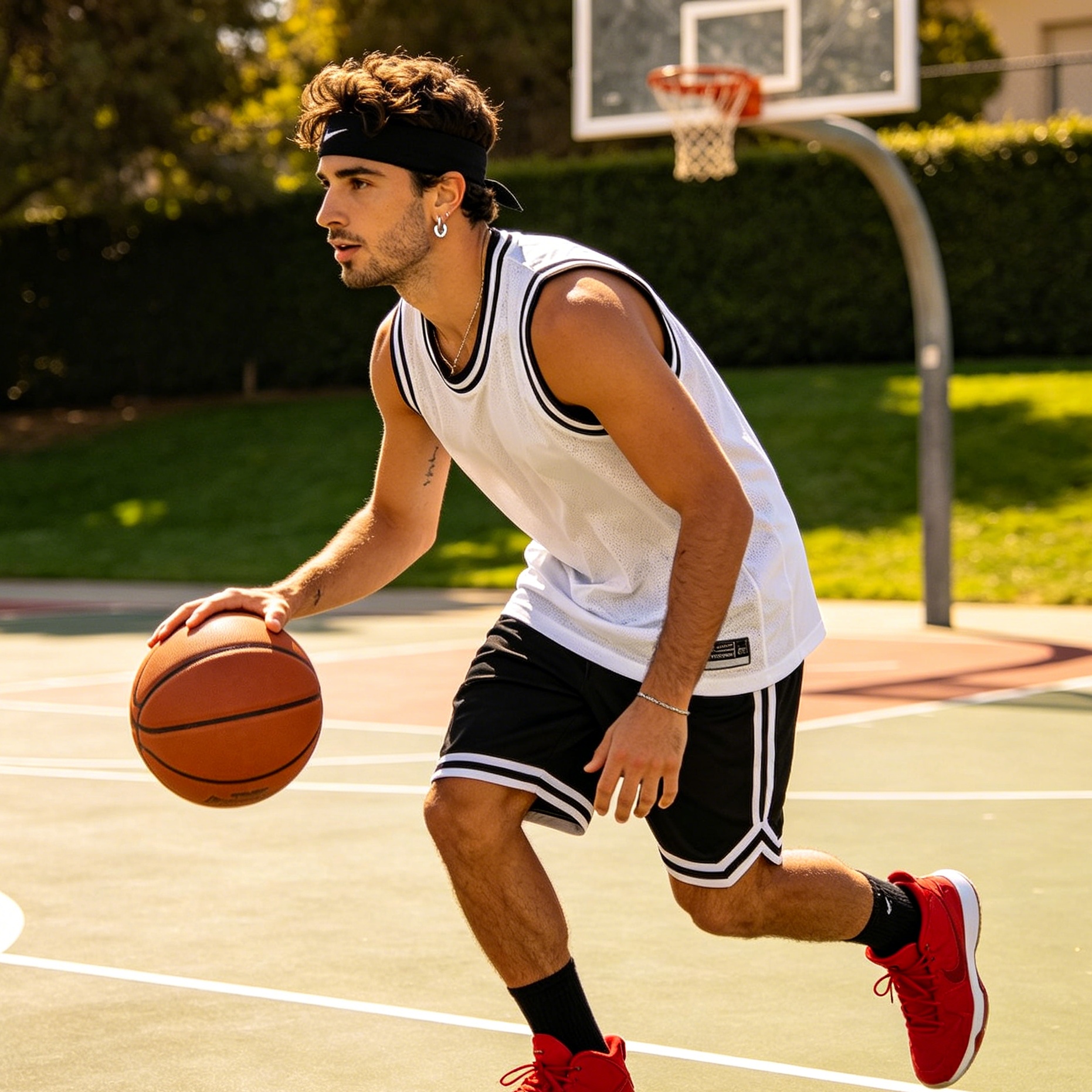
- 2026 Application: The "Maroon and Pink" combination is exceptionally flattering for Deep Summers. They can also pull off the "Red and Sky Blue" graphic looks seen on the Miiu Miu and Prada runways.
The New Neutrals: Elevating the Summer Aesthetic
One of the most refreshing aspects of the 2026 summer color palette is the redefinition of neutrals. We are seeing a move away from stark whites and flat beiges toward tones with more character.
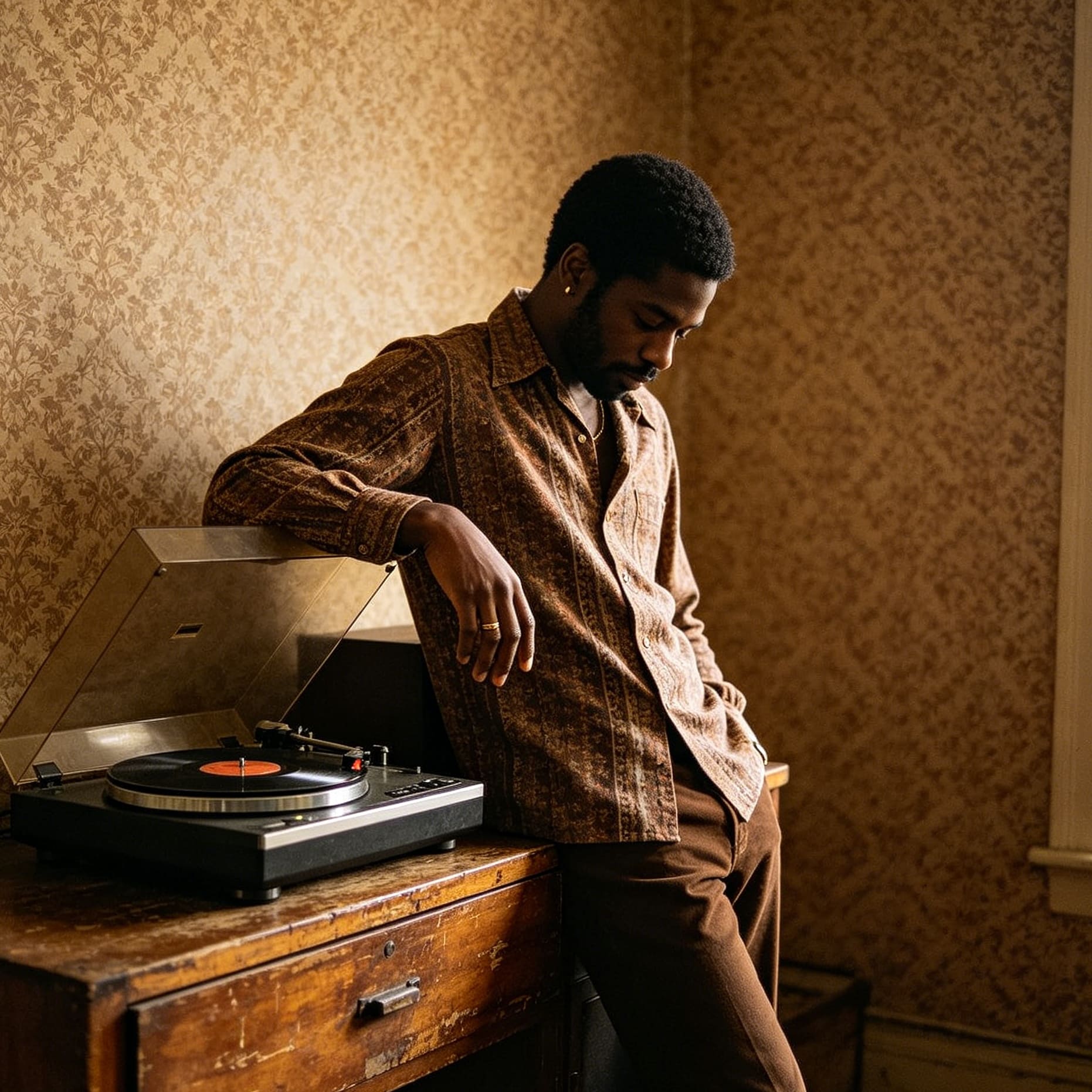
Chocolate Brown as a Summer Foundation
Traditionally reserved for autumn, chocolate brown has emerged as the premier grounding color for Summer 2026. When executed in lightweight fabrics like linen, silk, or cotton poplin, brown feels expensive and refined. It removes the harshness of black and the predictability of navy. Pairing chocolate brown with light blue or turquoise creates a balanced look that feels both grounded and airy.
Pistachio Green and Ivory
For those who prefer a more understated approach, the combination of pistachio and ivory is the gold standard for "Quiet Luxury" this season. Unlike a standard lime or neon green, pistachio is muted and milky. When paired with the creamy neutrality of ivory, it suggests an effortless elegance. This palette works best in textured fabrics—think lightweight knits, washed silks, and suede accessories. It is a calming alternative to the high-contrast primary colors seen elsewhere.
Creative and Design Applications: Beyond Fashion
The summer color palette isn't just for wardrobes; it’s a critical tool for digital creators, brand designers, and interior decorators looking to capture the spirit of 2026.
Santorini Blues and Monochromatic Depths
Inspired by Mediterranean landscapes, this palette uses multiple shades of blue—from cerulean and cyan to cornflower—anchored by a dense, rich white. In a branding context, this suggests reliability and coolness. It is an ideal palette for wellness brands or summer travel campaigns, providing a sense of calm in a high-heat season.
Tangerine Dream and Electric Vibe
For projects that require energy and high engagement, the 2026 palette offers "Tangerine Dream." This isn't just orange; it’s a spectrum that sits between orange creamsicle and bright poppy red. It represents a collective energy and a release of pent-up creativity. Use this palette when you want to inject a sense of fervor and life into a visual project. It pairs exceptionally well with chartreuse or "slime green" for a psychedelic, high-fashion pop.
Magnetic Magenta and Floral Punch
This is a multi-hued palette ranging from eye-popping purples to raspberry pinks. It mirrors a garden in full bloom—think bougainvillea and amethyst orchids. In interior design, these tones are being used for "accent immersion," where a single room or corner is saturated in these deep, punchy hues to create a dramatic, curated feel.
Practical Implementation: How to Style the 2026 Palette
Adopting a new summer color palette can feel intimidating if the colors are outside your usual comfort zone. The key to 2026 styling is the "Lead and Accent" rule. You do not need to wear a 50/50 split of two clashing colors. Instead, allow one color to lead the look and use the second as a sharp accent.
- Start with the Base: Choose a dominant color from the 2026 trends that matches your personal color season. For a Soft Summer, this might be a dusty blue dress.
- Add the Tension: Introduce a small amount of the contrasting trend color. For the blue dress, this could be a chocolate brown belt or a pair of maroon sandals. This creates the "tension" that makes the 2026 aesthetic work without making the outfit feel like a costume.
- Fabric Choice Matters: The vibrancy of a color changes depending on the material. A scarlet red in matte linen looks much more approachable than the same red in a shiny satin. Use matte textures for the bolder "clash" colors and save the sheen for the softer, more familiar tones.
- Consider the Environment: The 2026 palette is highly responsive to light. The "Grey and Burgundy" combination is perfect for the city, where the grey mimics the architecture and the burgundy adds a layer of professional richness. Conversely, the "Green and White" or "Turquoise and Espresso" pairings are designed for the outdoors and coastal environments, where natural light can fully activate the brightness of the greens and blues.
The Psychology of the 2026 Summer Spectrum
Why are we seeing these specific shifts now? The 2026 summer color palette reflects a broader cultural desire for clarity and intentionality. After years of chaotic trends and the rapid rise and fall of "core" aesthetics (like barbiecore or cottagecore), there is a move toward colors that feel "considered."
The use of burgundy in summer, for instance, suggests a defiance of traditional seasonal rules—a desire for a wardrobe that is versatile and meaningful rather than disposable. The contrast of butter yellow and cool blue reflects a need for balance—warmth without being stifling, coolness without being cold.
In conclusion, the summer color palette of 2026 is an invitation to experiment with contrast. By moving away from safe, monochromatic dressing and embracing the tension between soft and strong, warm and cool, and light and dark, you can create a visual identity that is both current and deeply personal. Whether you are updating your closet, redesigning a brand, or simply looking for fresh inspiration, these palettes provide the framework for a season defined by depth, energy, and sophisticated surprise.
-
Topic: From Butter Yellow to Burgundy: The Palettes Shaping Spring/Summer 2026https://elle.in/trending/the-palettes-shaping-spring-summer-2026-11728432
-
Topic: Summer Colors: Palettes We're Loving That Aren't Just Yellowhttps://www.shutterstock.com/blog/summer-color-palettes?amp=1&sa=U
-
Topic: Summer Color Palette | Seasons Color Palette Generatorhttps://www.colorseasons.space/summer