Home
Home
Why Your Next Interior Project Needs a Jewel Tones Color Palette

Why Your Next Interior Project Needs a Jewel Tones Color Palette
Jewel tones are no longer reserved for high-end boutique hotels or historical manors. In the current design landscape of 2026, these highly saturated hues—derived from the natural brilliance of gemstones like emeralds, sapphires, and rubies—have become the antidote to years of minimalist "sad beige" fatigue. A jewel tones color palette offers more than just visual impact; it provides a sense of sanctuary, emotional depth, and architectural character that lighter shades often fail to deliver.
Understanding a jewel tones color palette requires looking past basic color theory. These are colors with high saturation and a hidden depth, often grounded by a hint of black or charcoal. This inherent complexity allows them to shift under different lighting conditions, making a room feel dynamic throughout the day. Whether applied as a bold wall treatment or through strategic textile accents, these colors command attention and dictate the atmospheric narrative of a space.
The Anatomy of the Jewel Tones Color Palette
To effectively implement this palette, one must first master the primary "gemstones" that define the category. Each brings a distinct energy and psychological weight to a room.
Emerald Green: The Grounding Force
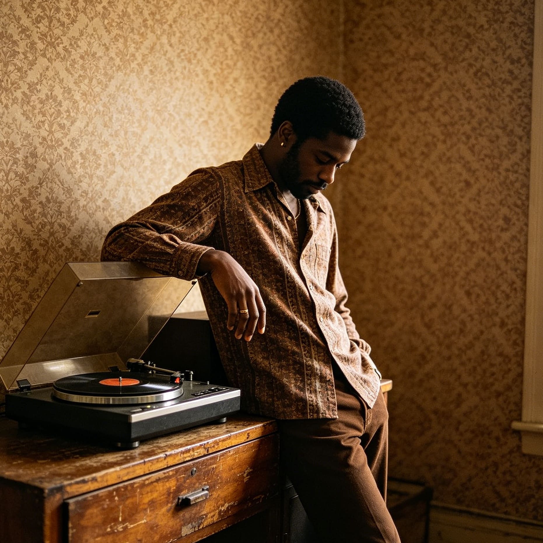
Emerald remains the most versatile of the jewel tones. Because green is so prevalent in nature, the human eye perceives even its most saturated versions as balanced and restorative. In a 2026 context, emerald is often used in "color drenching" scenarios—where walls, trim, and even ceilings are painted in the same hue. This creates a forest-like enclosure that feels both protective and sophisticated. It pairs exceptionally well with warm wood tones like walnut and cherry, which prevent the green from feeling too cold.
Sapphire Blue: The Intellectual Anchor
Sapphire is the sophisticated cousin of navy. While navy can sometimes feel flat or overly corporate, sapphire contains a vibrant luminosity that glows even in low light. It is a classic choice for libraries, home offices, and primary bedrooms because of its association with calm and focus. Sapphire works best when layered with different textures—think a velvet sofa against a matte-painted wall—to prevent the dark pigment from absorbing all the light in the room.
Ruby and Garnet: The Warmth of Drama
Red-based jewel tones are high-energy. Ruby is clear and fiery, while garnet leans toward a moodier, wine-infused depth. These colors are excellent for social spaces like dining rooms or entryways where you want to create a sense of arrival and occasion. Because red can be overwhelming in large doses, modern applications often use it in high-gloss finishes on cabinetry or as a statement rug that anchors a more neutral room.
Amethyst and Plum: The Regal Mystery
Purple jewel tones carry an air of historical luxury. Amethyst is brighter and more crystalline, while deep plum offers a grounded, earthy alternative. These shades are particularly effective in rooms meant for evening use. When paired with metallic accents like unlacquered brass or gold, amethyst creates a high-contrast, "jewel box" effect that feels intentionally curated.
Strategic Color Combinations for 2026
Creating a successful jewel tones color palette isn't just about picking one favorite stone; it’s about how these heavy hitters interact with each other and their surroundings.
The Monochromatic Layer
This approach involves choosing one jewel tone—for example, teal or aquamarine—and using various shades and tints of that same color throughout the space. By varying the saturation, you create a sophisticated gradient. A deep teal wall might be paired with a lighter seafoam velvet chair and dark navy accents. This provides depth without the visual chaos of multiple competing colors.
The Jewel and Neutral Balance
For those hesitant to go "all-in," jewel tones serve as perfect anchors for neutral schemes. A room with crisp white walls and light oak flooring can be instantly elevated by a single sapphire blue velvet sectional or a pair of emerald green lounge chairs. In this scenario, the jewel tone acts as the focal point, drawing the eye and giving the room a sense of purpose. The key is to keep the neutrals "clean"—avoiding yellowy beiges that can make jewel tones look muddy.
High-Contrast "Maximalism"
In 2026, we are seeing a resurgence of bold pairings: ruby with emerald, or sapphire with citrine. This works best when the colors share the same "value"—meaning they are equally dark or equally bright. When two jewel tones of the same intensity are placed together, they don't fight for attention; instead, they create a vibrant, high-fashion energy. This is often achieved through patterned wallpaper or eclectic upholstery.
The Role of Sheen and Texture
A jewel tones color palette is uniquely sensitive to the surfaces it occupies. The same pigment can look radically different in a matte finish versus a high-gloss lacquer.
- Matte Finishes: A matte jewel-toned wall absorbs light, making the color feel "velvety" and deep. This is ideal for large living areas or bedrooms where you want to minimize glare and emphasize the moodiness of the shade.
- High-Gloss and Lacquer: Glossy finishes reflect light, making the color appear more vibrant and "wet." This is a popular choice for 2026 powder rooms, wet bars, and kitchen islands. A high-gloss burgundy or forest green cabinet can act as a piece of jewelry for the home.
- Textural Interplay: Jewel tones are the natural companions of tactile fabrics. Velvet is the gold standard for these colors because the pile of the fabric creates natural highlights and shadows, showing off the multi-dimensional nature of the pigment. Mohair, heavy linen, and even dark leathers provide similar depth.
Lighting the Saturated Space
The most common mistake when using a jewel tones color palette is inadequate lighting. Because these colors are dark and saturated, they require a thoughtful layering of light sources to keep the space from feeling like a cave.
- Warm Color Temperature: Jewel tones thrive under warm light (2700K to 3000K). Cool, blue-toned LED lighting can make these rich colors look grey and lifeless.
- Layered Lighting: Relying on a single overhead light will wash out the depth of the palette. Instead, use a combination of floor lamps, table lamps, and wall sconces. This creates "pools" of light that highlight the richness of the colors in specific areas.
- Accent Lighting: Use picture lights or directional spots to illuminate jewel-toned walls. This draws out the undertones of the paint and adds a gallery-like sophistication to the room.
Room-by-Room Application Guide
The Entryway: The Bold Welcome
The entryway is the perfect place to experiment with a jewel tones color palette because it is a transition space. You aren't spending hours here, so a high-impact color like deep garnet or amethyst can provide a memorable first impression without being exhausting.
The Kitchen: The Modern Hearth
Moving away from all-white kitchens, 2026 trends favor deep teal or emerald green cabinetry. When paired with marble countertops and brass hardware, these colors make the kitchen feel like a furnished living space rather than a utilitarian lab. If full cabinets are too much, consider a jewel-toned tiled backsplash or a painted kitchen island.
The Bedroom: The Moody Retreat
For a sleep-conducive environment, sapphire and deep jade are unmatched. These colors lower the visual energy of the room, signaling to the brain that it is time to rest. Painting the ceiling in the same dark shade as the walls—a technique known as "the fifth wall"—can create a cozy, cocoon-like effect that is incredibly luxurious.
The Home Office: The Focus Zone
A jewel tones color palette can actually aid concentration. Deep colors reduce the amount of reflected light bouncing off walls, which can minimize eye strain during long hours at a computer. A dark amethyst or charcoal-leaning navy provides a professional yet creative backdrop for video calls.
Avoiding the "Cave" Effect
While the goal of a jewel tones color palette is often drama, one must avoid making a room feel claustrophobic. Balance is achieved through a few key techniques:
- White Trim and Ceilings: If you aren't ready for color drenching, keep your baseboards and ceilings a crisp white. This provides a "frame" for the jewel tones and keeps the room feeling airy.
- Mirrors and Metallics: Reflective surfaces are essential. A large gold-framed mirror or a glass coffee table breaks up the solid blocks of dark color and bounces light back into the room.
- Natural Light Integration: If a room has large windows, it can handle even the darkest jewel tones. The natural light will reveal the hidden vibrance in the pigment, preventing it from looking black.
Sustainability and Quality in Saturated Pigments
When working with a jewel tones color palette in 2026, the quality of the paint or material matters more than ever. High-saturation colors require more pigment, and cheaper paints often lack the "hide" or coverage needed to create a smooth finish. It is often recommended to use a tinted primer that matches the final color to ensure the depth is consistent across the wall. Additionally, many modern brands now offer eco-friendly, low-VOC options that don't sacrifice the intensity of these gemstone hues.
In conclusion, the jewel tones color palette is a tool for those who want their homes to feel intentional, curated, and emotionally resonant. By understanding the balance of saturation, light, and texture, anyone can transform a standard room into a sophisticated sanctuary that feels timeless yet perfectly in sync with the design sensibilities of 2026.
-
Topic: Jewel-Toned Paint Colours | Benjamin Moorehttps://www.benjaminmoore.com/en-ca/colour-overview/colour-insights/jewel-toned-paint-colours
-
Topic: What Are Jewel Tone Colors? 10 Hues That Create Gorgeous Interior | Apartment Therapyhttps://www.apartmenttherapy.com/how-to-decorate-jewel-tone-colors-37524702
-
Topic: Jewel Tone Color Palettes for Depth & Drama | Wayfairhttps://www.wayfair.com/sca/ideas-and-advice/styles/jewel-tone-color-palettes-T24100