Home
Home
Visual Patterns That Reveal if an Image Is AI Generated
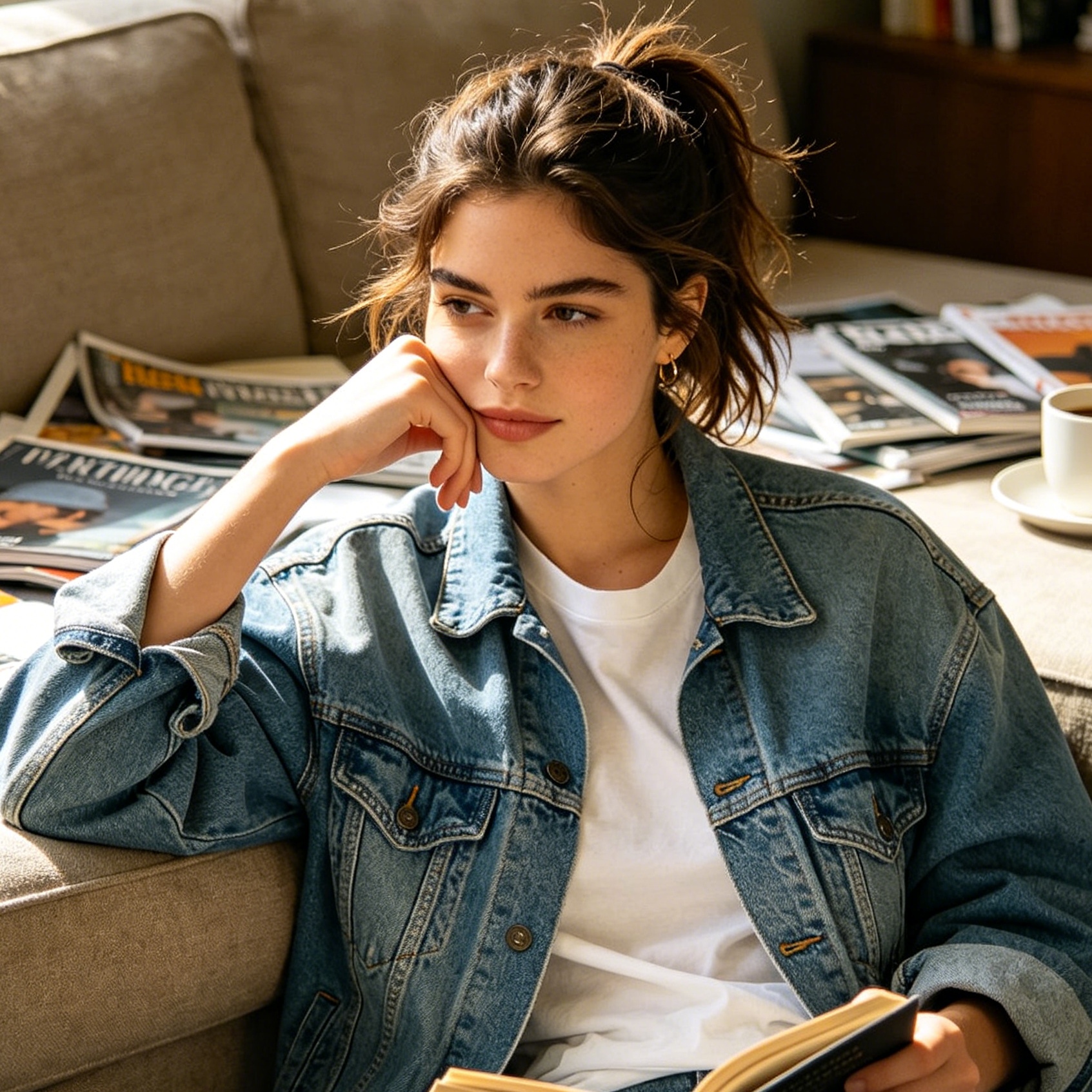
Distinguishing between human creativity and algorithmic output has become a critical digital literacy skill. As generative models like Midjourney, DALL-E 3, and Flux continue to iterate, the "telltale signs" of artificial intelligence are shifting from glaring errors to subtle logical inconsistencies. Understanding how to identify AI-generated art requires a combination of artistic observation, knowledge of how latent diffusion works, and an eye for the "uncanny valley."
The fundamental reason AI makes mistakes is that it does not understand the physical world. Instead, it predicts pixel patterns based on statistical probabilities derived from trillions of training images. It knows what a "hand" looks like in a flat 2D space, but it does not understand that a hand has a specific bone structure that limits its movement. This lack of grounded reality creates "hallucinations"—small, illogical glitches that serve as digital fingerprints.
Anatomical Anomalies in Human Subjects
Human anatomy remains the most difficult challenge for generative models. While 2023 was the year of "six-fingered hands," 2025 has seen models become more proficient at counting. However, the complexity of human joints and the way skin interacts with light still provide significant clues.
The Complexity of Hands and Fingers
Even when an AI correctly generates five fingers, it often fails at the "inter-digital logic." Look closely at where the fingers meet the palm. In many AI images, fingers appear to sprout from the side of the hand or merge together like melting wax.
Another common error is the length of phalanges. Human fingers have three distinct segments that decrease in size toward the tip. AI often creates "telescoping" fingers where the segments are of equal length, or where a finger seems to have four or five joints. Pay attention to the grip; if a person is holding a coffee cup, the fingers should wrap around the object with visible tension. AI often depicts fingers "fusing" into the ceramic or resting at angles that would require a broken bone.
Facial Features and Symmetry
AI models are trained on high-quality portraits, leading to a bias toward hyper-symmetry. While human faces are generally symmetrical, they possess thousands of micro-asymmetries—a slightly lower eyebrow, a mole on one side, or a subtle tilt in the jawline. AI portraits often look "too perfect," creating an unsettling aesthetic.
The eyes are particularly revealing. Check the pupils and the reflections (catch-lights). In a real photograph, the reflection of light in the eyes should match the environment and the light source. AI often generates mismatched reflections or pupils that are not perfectly circular. Teeth are another major giveaway. Instead of individual teeth with distinct gaps and varying shapes, AI often produces a "monotooth" effect—a continuous white block or a row of teeth that extends too far back into the jaw.
Ears and Jewelry
Ears have complex, individualized cartilage structures (the helix, antihelix, and tragus). AI often treats ears as generic "swirls," leading to shapes that look more like abstract pasta than human anatomy. This is especially true when hair covers part of the ear; the AI may struggle to "reconstruct" the hidden part, leading to a blurred or mangled connection. Jewelry, such as earrings or necklaces, often lacks functional logic. An earring might be hanging from the cheek instead of the earlobe, or a necklace chain might disappear into the skin and reappear on the other side.
The Synthetic Aesthetic and Surface Textures
Artificial intelligence tends to produce images that are "average" versions of their training data. This results in a specific synthetic look that lacks the grit and imperfection of real-world materials.
The Problem of Over-Smoothing
AI-generated faces often suffer from what is known as "airbrushed skin." Real skin has pores, fine hairs, scars, and uneven pigmentation. While high-end retouching in photography can minimize these, AI goes a step further by creating a texture that resembles polished plastic or porcelain. When zooming in, the lack of "micro-detail" becomes apparent. In a real photo, even at high resolution, you can see the grain of the skin; in an AI image, the skin often looks like a smooth gradient.
Hair and Fine Fibers
Hair is a massive computational challenge. Human hair consists of thousands of individual strands that overlap, catch the light differently, and have flyaways. AI hair often looks like a solid "mass" or "clumps." The edges where hair meets the background are particularly telling; the strands may dissolve into a digital blur or "smudge" into the sky. This is because the model is trying to balance the sharp detail of the hair with the soft bokeh of the background and fails to maintain a clean edge.
Fabric and Pattern Logic
Look at the patterns on clothing. A human artist or a real photograph will show a plaid or floral pattern that follows the folds and shadows of the fabric. AI often "pastes" the pattern onto the shape of the clothing. The stripes on a shirt might stay perfectly straight even as the fabric wrinkles, or a floral print might morph into a different kind of flower halfway across the chest. Additionally, buttons and zippers frequently lack functionality—buttons might have no holes, or a zipper might end abruptly in the middle of a garment.
Physics and Environmental Inconsistencies
Because AI does not calculate light or gravity, it often violates the basic laws of physics. These errors are more subtle but are highly reliable indicators of synthetic origin.
Light Sources and Shadow Alignment
In a real environment, shadows are cast in the opposite direction of the light source. If there is a sun in the top-right corner, every shadow in the image must lean toward the bottom-left. AI often struggles with multiple light sources. You might see a person's shadow pointing left while a nearby tree's shadow points right. Furthermore, "contact shadows"—the dark areas where an object touches the ground—are often missing or misplaced, making objects look like they are "floating" on the surface.
Reflections and Transparency
Check the reflections in water, glass, or polished floors. A reflection should be a distorted but logical mirror of the object above it. AI often generates reflections that do not match the subject. A person might be wearing a red hat, but their reflection in a puddle shows a bare head. Similarly, looking through a glass of water should refract the background; AI often ignores this, treating the glass as a simple overlay rather than a refractive object.
Architectural Logic and Perspective
Architectural elements like stairs, railings, and windows require rigid geometric precision. AI is notoriously bad at "long-range" consistency. A staircase might start with five steps but lead into a solid wall. A railing might have balusters that are spaced unevenly or change shape as they move into the distance. Perspective lines (vanishing points) often fail to converge correctly, creating a "warped" sensation where the floor and walls seem to exist in different dimensions.
Typography and Graphetic Errors
For years, the inability to render text was the easiest way to spot AI art. While newer models like DALL-E 3 and Flux have improved significantly, text remains a high-entropy area where errors frequently occur.
Garbled and Nonsensical Text
If an image contains a sign, a book cover, or a branded shirt, read the text carefully. Even if the letters look like English at a glance, they are often nonsensical strings of characters or "alien" symbols that mimic the shape of the Latin alphabet but form no real words. In 2025, models are better at short words (like "STOP" or "OPEN"), but longer sentences almost always devolve into gibberish.
Typeface Inconsistency
Even when the words are spelled correctly, the "font" often fails to remain consistent. A single word might have an "S" that is bold and serifed, while the "T" is thin and sans-serif. The baseline of the text—the imaginary line the letters sit on—may curve or tilt unnaturally. In graphic design contexts, AI often struggles with "kerning" (the space between letters), resulting in characters that overlap or are spaced too far apart.
The UI and Digital Design Fingerprint
AI is not just used for "paintings" or "photos"; it is increasingly used to generate website mockups and app interfaces. These have their own set of specific visual tells.
The "Indigo-Purple" Bias
A fascinating observation in the design community is the prevalence of the "purple-to-indigo" gradient. Many AI generators, particularly those used for UI/UX (like v0 or Cursor), default to a specific shade of indigo-500 (#6366f1) or violet-500. If you see a "SaaS landing page" with neon-on-dark accents and a purple glow, there is a high statistical probability it was AI-influenced. This is a result of the models being trained on a massive volume of modern Dribbble and Behance templates from the early 2020s.
The Default Typeface
The font "Inter" has become the unofficial typeface of the AI generation. Because Inter is open-source and ubiquitous in modern web design, it dominates the training data. If a design lacks any typographic personality and defaults to a perfectly clean, geometric sans-serif that looks exactly like Inter, it may be an unedited AI output.
Placeholder Content Hallucinations
In UI mockups, AI often generates "lorem ipsum" text that isn't actually Latin. It creates "pseudo-lorem," which looks like text blocks from a distance but is actually just wavy lines or distorted characters. Similarly, profile pictures in "Our Team" sections often show the anatomical errors mentioned earlier—extra ears or fused glasses.
Contextual and Stylistic Clues
Sometimes, the "tell" isn't in the pixels themselves, but in the context of the piece. AI art lacks "intent" and "provenance."
The Absence of Artistic Process
Human artists typically have a trail of work. This includes sketches, earlier versions, process videos, and a consistent evolution of style. AI art often appears "out of nowhere" on social media accounts with no history. If an account posts ten masterpieces in ten completely different styles (e.g., oil painting, 3D render, watercolor, pencil sketch) within two days, it is almost certainly using AI. Humans take weeks to master a single style; AI switches styles in seconds.
The "Median" Composition
Because AI is trained on what is "average," its compositions tend to be very safe. Centered subjects, rule-of-thirds alignments that are mathematically perfect, and standard "cinematic" lighting are the defaults. A human artist might make "daring" choices—intentionally breaking the rules of composition to evoke an emotion. AI art often feels "hollow" or "generic" because it is optimizing for aesthetic appeal rather than emotional expression.
Edge Control and Focus
In photography, "Depth of Field" (the blurriness of the background) is determined by the camera's lens and aperture. AI often applies blur in a way that doesn't make sense. You might see a sharp subject, a blurry background, but a single leaf in the background that is inexplicably sharp. This is a failure of "global coherence"—the AI forgets which plane of depth that leaf belongs to.
Using AI Detection Tools and Metadata
When visual inspection isn't enough, technology can assist in the verification process.
Examining Metadata and C2PA
Many AI generators now embed metadata or "invisible watermarks" into the files they create. Organizations like the Content Authenticity Initiative (CAI) have developed the C2PA standard, which provides a "nutrition label" for digital content. If you download an image, you can use specialized viewers to see if it has been tagged as "Synthetically Generated." However, this metadata can easily be stripped by taking a screenshot or re-saving the file.
Algorithmic Detectors
There are several web-based tools designed to detect the statistical signatures of AI. Tools like Hive Moderation, Illuminarty, and "AI or Not" look for "spectral artifacts"—patterns in the high-frequency components of an image that are invisible to the human eye but characteristic of the diffusion process. While these tools are not 100% accurate, they provide a "confidence score" that can support your visual findings.
Summary
Identifying AI-generated art is a skill that evolves alongside the technology. While the "six-fingered hand" is becoming a thing of the past, the core limitations of AI—its lack of physical understanding, its reliance on statistical averages, and its struggle with long-range logical consistency—remain.
To tell if art is AI-generated, look for:
- Anatomical logic: Fingers, teeth, and ears.
- Physics: Shadow direction and reflections.
- Texture: Over-smoothed skin and clumpy hair.
- Logic: Text that makes sense and architecture that follows a path.
- Context: The history of the artist and the diversity of their output.
As models become more "perfect," the most reliable tell will often be the absence of human "imperfection"—the lack of a deliberate, slightly flawed choice that makes art truly human.
FAQ
Can AI detection tools be trusted? Not entirely. They are useful as a secondary check, but they often produce "false positives" on heavily edited human photos or "false negatives" on highly polished AI art. Always combine tool data with visual inspection.
Do all AI images have metadata? No. Most social media platforms strip metadata when you upload an image. Furthermore, many open-source models do not include "origin" tags by default.
Will it eventually be impossible to tell the difference? Technically, yes. As models begin to incorporate "physics engines" and better anatomical 3D maps, the visual errors will disappear. At that point, identification will rely almost entirely on "provenance" (the verified record of how the image was created) and cryptographic watermarking.
Why does AI struggle with text so much? Diffusion models "see" text as a visual pattern rather than a linguistic one. To an AI, the letter "B" is just a shape with two loops. It doesn't understand that the order of letters creates meaning, which is why it often swaps them or creates "shapes that look like letters."
Is AI art considered "fake"? "Fake" is a subjective term. In a commercial or journalistic context, representing an AI image as a real photograph is deceptive. However, in an artistic context, AI is often used as a tool for creation. The key is transparency and disclosure.
-
Topic: ArtUnmasked: A Multimodal Classifier for Real, AI, and Imitated Artworkshttps://pdfs.semanticscholar.org/8d5f/facec69639989bd27573068a6d9ed0b26555.pdf
-
Topic: How to Tell If Art Is AI Generated: A Complete Guide | Open Journeyhttps://www.openjourney.art/blog/how-to-tell-if-art-is-ai-generated
-
Topic: GitHub - febbhav/signs-of-ai-design: A field guide to the visual tells of AI-generated design. Like Wikipedia's Signs of AI writing, but for visuals. · GitHubhttps://github.com/febbhav/signs-of-ai-design